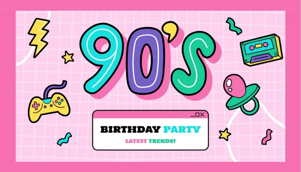
The 1990s were a decade of bold experimentation, cultural shifts, and a distinctive aesthetic that continues to influence design today. From the rise of grunge music and dial-up internet to vibrant pop culture and early digital graphics, the era left an indelible mark on typography. 90s fonts are more than just nostalgic relics; they are a diverse collection of typefaces that embody the raw energy, playful spirit, and burgeoning technological optimism of the period. Far from being confined to retro throwbacks, these fonts are experiencing a significant revival, adding a unique blend of vintage charm and edgy personality to contemporary designs.
This guide will take a deep dive into the characteristics that define 90s typography, explore the iconic fonts that shaped the decade, and discuss how designers are cleverly integrating them into modern projects. Whether you’re aiming for a grunge aesthetic, a futuristic vibe, or a whimsical touch, understanding the enduring appeal of 90s fonts can help you infuse your designs with a powerful sense of nostalgia and individuality.
The Defining Characteristics of 90s Typography
The 90s graphic design scene was a melting pot of influences, rejecting the rigid rules of previous decades in favor of a more expressive, often rebellious, approach. This experimental spirit directly translated into the typography of the era. Key characteristics that typified 90s fonts include:
- Bold and Chunky Forms: Fonts from the 90s weren’t afraid to make a statement. They often featured thick, heavy letterforms and condensed widths that demanded attention, making them ideal for headlines, posters, and branding.
- Geometric Inspiration: Many 90s fonts drew inspiration from basic geometric shapes like circles, squares, and triangles. This gave them a clean, often blocky, and somewhat futuristic feel, reflecting the growing influence of digital design.
- Playful and Whimsical: The decade saw a rise in “fun” fonts with rounded corners, exaggerated curves, and a hand-drawn charm. These typefaces added a personal, informal touch to designs, often seen in cartoons, children’s media, and casual communication.
- Grunge and Distressed Textures: Influenced by the alternative music scene, many 90s fonts embraced a raw, unpolished, and distressed aesthetic. Rough edges, uneven spacing, and worn-out appearances conveyed a rebellious, anti-establishment vibe.
- Futuristic and Techno Vibes: With the advent of personal computers and the internet, typography began to reflect a fascination with technology. Fonts with clean lines, sharp angles, and a minimalist approach became synonymous with innovation and digital interfaces.
- Vibrant Gradients and Neon Effects: While not inherent to the font itself, 90s typography was often paired with bold, vibrant colors and neon gradients, especially in rave posters and early web graphics, creating a distinct retro-futuristic look.
- DIY Aesthetic: A sense of imperfection and a handcrafted feel were also popular, leading to the widespread use of handwritten and “homemade” looking fonts that conveyed authenticity and individuality.
Iconic 90s Fonts That Defined a Decade
Many typefaces emerged or gained immense popularity in the 1990s, becoming synonymous with the era’s diverse cultural movements. Here are some of the most famous and influential 90s fonts:
- Comic Sans MS: Perhaps the most controversial font of the decade, Comic Sans embodied the playful, casual, and often whimsical side of 90s design. Despite its overuse and subsequent disdain in some design circles, it remains an iconic symbol of the era’s informal communication.
- Impact: A bold, heavy, and condensed sans-serif, Impact dominated headlines and posters. Its thick strokes made a strong visual statement, living up to its name. It was widely used for its attention-grabbing power.
- Arial: While released earlier, Arial became ubiquitous in the 90s as a default font in early operating systems and word processors, making it one of the most widely seen typefaces of the decade.
- Century Gothic: Released in 1990, Century Gothic quickly became popular for its clean, geometric, and modern sans-serif design, reflecting the decade’s lean towards digital clarity.
- Bauhaus 93: With its distinctive rounded, geometric forms, Bauhaus 93 exuded a futuristic yet playful vibe, often seen in tech-related designs and children’s media.
- Jokerman: Known for its exaggerated strokes and swirling decorative elements, Jokerman was a highly decorative and whimsical font that added a unique, often quirky, flair to designs.
- Cooper Black: This bold, rounded serif font, despite its earlier origins, experienced a resurgence in the 90s, appearing frequently on album covers, product branding, and posters for its friendly yet impactful presence.
- Eurostile: Characterized by its clean, geometric lines and futuristic aesthetic, Eurostile became synonymous with technology and science fiction designs of the era.
- Curlz MT: A whimsical and curvaceous font, Curlz MT found its way onto countless birthday cards, party invitations, and designs targeting younger audiences, embodying a carefree spirit.
- VAG Rounded: With its soft curves and friendly appearance, VAG Rounded gained popularity for logos and signage, notably associated with Volkswagen branding.
- Bank Gothic: A condensed sans-serif font, Bank Gothic exuded an industrial strength and authoritative look, commonly used in corporate and tech designs.
- Kristen ITC: A playful, handwritten font, Kristen ITC added a personal and casual touch, popular for its friendly and approachable appearance in informal contexts.
Where 90s Fonts Were Used
The pervasive influence of 90s fonts could be seen across various media and industries:
- Album Covers & Music Promotion: The grunge movement heavily utilized distressed and raw fonts (like “Wasted Youth”), while rave culture embraced futuristic and psychedelic typefaces with vibrant gradients.
- TV Shows & Movies: Many sitcom intros, movie posters, and show titles adopted the playful, bold, or futuristic styles of the decade (e.g., “Saved by the Bell,” “The Fresh Prince of Bel-Air”).
- Video Games: Early video game interfaces and branding often featured pixelated, blocky, or futuristic fonts that reflected the emerging digital world.
- Product Packaging & Branding: From snack foods to toys, many products used bold, colorful, and often bubbly fonts to appeal to a younger, energetic consumer base.
- Early Websites & Digital Interfaces: As the internet became more accessible, designers experimented with fonts that conveyed a sense of novelty and technological advancement, often incorporating geometric or “digital” aesthetics.
- Advertising & Billboards: The bold and impactful nature of many 90s fonts made them perfect for grabbing attention in advertisements.
- School Projects & Casual Communication: Fonts like Comic Sans and Curlz MT became staples for informal documents, invitations, and school assignments due to their approachable and less formal feel.
The 90s Font Revival: Integrating Nostalgia into Modern Design
Today, 90s fonts are experiencing a significant resurgence, driven by a wave of nostalgia and a desire for designs that stand out from the minimalist trends of recent years. Designers are not just copying the past; they are reinterpreting 90s typography with a contemporary twist.
How to Use 90s Fonts in Modern Design:
- Strategic Pairing: Avoid overwhelming your design by pairing a bold 90s display font (for headlines or logos) with a clean, modern sans-serif or serif font for body text. This creates visual interest without sacrificing readability.
- Context is Key: Consider the overall tone and message of your project. A grunge font might be perfect for a band poster or an edgy apparel brand, while a bubbly font could suit a playful app or a retro-themed event.
- Subtle Accents: You don’t need to go full 90s. Use a 90s font for a small, impactful detail, like a sub-headline, a graphic element, or a specific call-out, to add a touch of nostalgia without dominating the design.
- Modern Color Palettes: Combine 90s fonts with contemporary color schemes to give them a fresh, updated feel. Or, lean into the 90s aesthetic with neon, vibrant gradients, or abstract patterns for a full retro immersion.
- Embrace Imperfection: For grunge or DIY-inspired fonts, don’t be afraid to pair them with distressed textures or hand-drawn elements to enhance their authentic, raw vibe.
- Less is More (for wild fonts): Some 90s fonts, like Jokerman or Curlz MT, are highly decorative. Use these sparingly, perhaps only for very short headlines or decorative elements, to avoid visual clutter.
Tools for Discovering and Using 90s Fonts
Many resources are available for finding and implementing 90s fonts in your projects:
- Font Marketplaces:
- Creative Market: Offers a wide selection of modern interpretations and revivals of 90s fonts, often in bundles.
- Envato Elements: A subscription service with a vast library of 90s-inspired fonts, including grunge, retro, and playful styles.
- MyFonts: A large font marketplace where you can search specifically for “90s fonts” or browse by characteristics like “grunge” or “rave.”
- Free Font Sites:
- Dafont: Offers a huge collection of free fonts, many of which are inspired by 90s aesthetics. Always check licensing for commercial use.
- Font Squirrel: Provides high-quality, hand-picked free fonts that are often suitable for commercial use. You might find 90s-inspired options here.
- Resource Boy: Features a curated collection of free and premium 90s fonts, often with previews of their application.
- Design Inspiration:
- Designhill Blog: Offers lists and examples of 90s fonts and how to use them.
- VisualHierarchy: Provides insights into iconic 90s fonts and their application in modern design.
- CorelDRAW.com: Discusses the broader graphic design styles of the 90s, including typography.
Conclusion
The 1990s were a pivotal decade for graphic design, and its typographic trends continue to resonate. 90s fonts, with their diverse range from bold and grungy to playful and futuristic, offer designers a rich palette for injecting personality, energy, and a compelling sense of nostalgia into their work. By understanding the characteristics of this era’s typography and applying them thoughtfully, you can create designs that are both retro-inspired and distinctly modern. Embrace the spirit of experimentation, pair these iconic typefaces with contemporary elements, and let the unique vibe of the 90s elevate your next design project.
Ready to infuse your designs with a dose of 90s flair? Explore these fonts and start experimenting! Share this blog with fellow designers and nostalgia enthusiasts!
Frequently Asked Questions (FAQs)
Q1: What are the main characteristics of 90s fonts?
90s fonts are characterized by boldness, chunkiness, geometric shapes, playful and whimsical elements, grunge/distressed textures, and often a futuristic or techno vibe. They reflect the decade’s experimental and rebellious spirit in design.
Q2: Are 90s fonts still relevant in modern design?
Absolutely! 90s fonts are experiencing a strong revival. They are used to evoke nostalgia, add personality, create unique branding, and provide a distinct visual contrast to more minimalist contemporary designs.
Q3: Can I use 90s fonts for professional projects?
Yes, but with careful consideration. While some 90s fonts (like Comic Sans) might be considered unprofessional in certain contexts due to overuse, others (like Century Gothic or more subtle grunge fonts) can be used effectively for branding, headlines, posters, and digital interfaces, especially for brands aiming for a retro, playful, or edgy aesthetic.
Q4: How can I avoid making my design look outdated when using 90s fonts?
To avoid an outdated look, pair 90s display fonts with modern, clean body text fonts. Use contemporary color palettes, and apply the 90s font strategically for emphasis rather than for large blocks of text. Focus on a specific 90s sub-style (e.g., grunge, rave, tech) rather than trying to incorporate all of them.
Q5: Where can I find free 90s fonts?
You can find free 90s fonts on websites like Dafont, Font Squirrel, and Resource Boy. Always check the licensing terms for each font to ensure it’s suitable for your intended use (personal vs. commercial).
Q6: What’s the difference between a “grunge” font and a “rave” font from the 90s?
A “grunge” font typically features distressed textures, rough edges, and an unpolished, raw appearance, reflecting the anti-establishment music movement. A “rave” font, on the other hand, often has a more futuristic, psychedelic, or bubbly aesthetic, sometimes incorporating distorted or liquid-like letterforms, reflecting the electronic music and party scene.
Q7: How did technology influence 90s typography?
The rise of personal computers and early digital design tools allowed for more experimentation with typography. Fonts became more geometric, pixelated, and often mimicked digital displays. The ability to easily manipulate type in software also led to more playful and distorted effects that were characteristic of the decade.