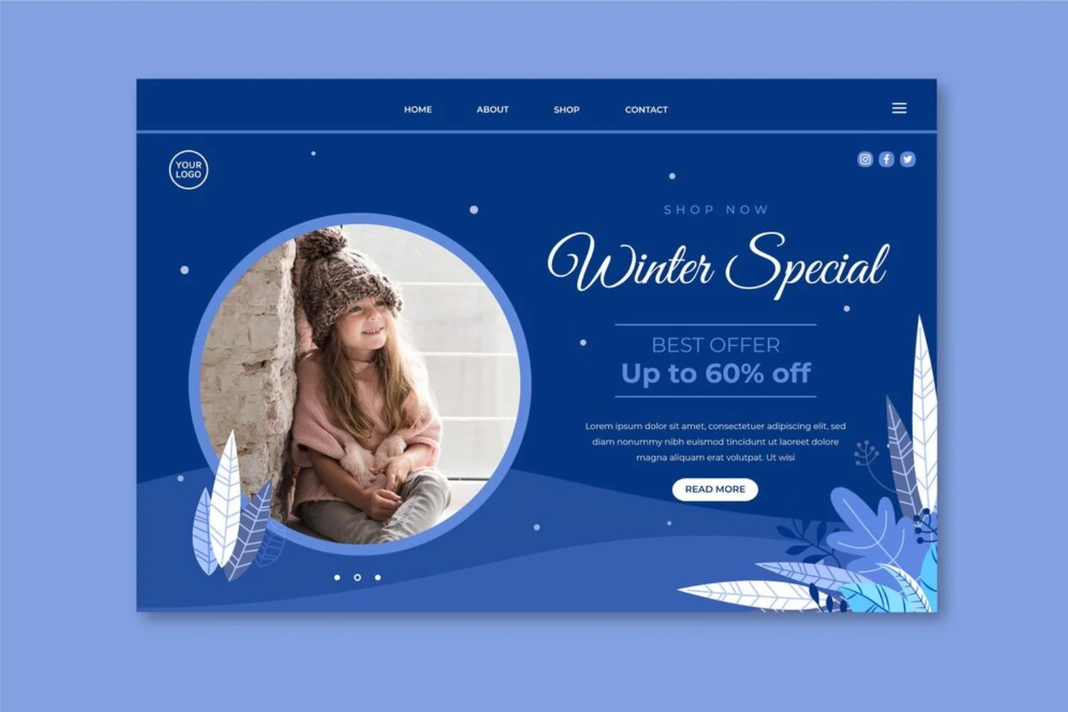
The color blue holds an undeniable prominence in web design, frequently chosen for its powerful psychological associations with trust, stability, professionalism, and calm. Following our previous exploration of “Blue Decoration Websites,” this document expands further, offering an even more extensive and diverse collection of examples that demonstrate the myriad ways blue can be effectively utilized to shape a website’s aesthetic, influence user perception, and reinforce brand identity.
This showcase moves beyond general categories to highlight specific design approaches and the unique impact of various blue hues and their combinations. Whether used as a dominant background, a vibrant accent, or a subtle thematic element, these examples illustrate blue’s versatility in creating digital experiences that are both visually compelling and strategically effective.
The Enduring Appeal of Blue in Web Design
Blue’s widespread adoption in web design is no accident. Its inherent qualities make it suitable for a vast array of purposes:
- Trust & Credibility: Ideal for finance, healthcare, and corporate sectors.
- Calmness & Serenity: Perfect for wellness, educational, and lifestyle brands.
- Professionalism & Authority: A staple for B2B, tech, and legal services.
- Innovation & Technology: Often seen in SaaS, cloud, and AI companies.
- Cleanliness & Freshness: Used in health, beauty, and environmental themes.
By observing how different websites leverage blue, we can gain insights into effective color psychology and design implementation.
Expanded Showcase: 50+ Blue Website Examples
This curated list provides additional examples, focusing on diverse applications of blue, including specific color pairings and design techniques.
I. Deep & Authoritative Blues (Trust, Corporate, Seriousness)
- Silverstream Technologies
- Description: This website features a gradient-driven blue theme, complemented by futuristic micro-interactions and circular imagery with fluid motion. It conveys technological sophistication and innovation.
- Primary Blue Use: Dominant, deep blue gradients for a futuristic, high-tech feel.
- Link: (Specific link may vary, search “Silverstream Technologies website” if direct link is unavailable)
- Broad Institute
- Description: Uses a highly immersive POV video introduction and clearly divided sections. The deep blue tones provide a professional and academic backdrop for scientific research and complex information.
- Primary Blue Use: Deep blue as a foundational, serious color.
- Link: https://www.broadinstitute.org/
- Monocle Solutions
- Description: A solutions provider that likely uses deep blues to convey clarity, efficiency, and strategic thinking, often with clean layouts and strong calls to action.
- Primary Blue Use: Deep blue for a clear, strategic impression.
- Link: https://www.monoclesolutions.com/
- CoverMyMeds Careers
- Description: The careers page for a healthcare technology company. It uses blue to convey professionalism, trust, and a positive work environment, aligning with the company’s brand values.
- Primary Blue Use: Professional blue for trust and positive environment.
- Link: https://www.covermymeds.com/main/careers/
- HashiCorp
- Description: A company providing open-source tools for cloud infrastructure. Their website is content-rich, well-organized, and designed to serve a highly technical audience with extensive documentation and resources, using deep blues for reliability.
- Primary Blue Use: Deep blue for robust, reliable infrastructure.
- Link: https://www.hashicorp.com/
- Sentry
- Description: An error monitoring platform with a website that balances technical information with clear marketing messaging, featuring engaging illustrations and a professional layout, often with dark blue backgrounds.
- Primary Blue Use: Dark blue for a professional, technical backdrop.
- Link: https://sentry.io/
- Linear
- Description: A project management tool with a highly polished and minimalist website. It features subtle animations, excellent typography, and a focus on clarity and efficiency, appealing to a tech-savvy audience, often using dark blue as a primary or accent color.
- Primary Blue Use: Dark blue for minimalist polish and clarity.
- Link: https://linear.app/
- GitHub
- Description: The world’s leading platform for developer collaboration. Its website is a masterclass in functional design for a highly technical audience, focusing on usability, search, and community features, with a prominent dark blue header and UI elements.
- Primary Blue Use: Dark blue for functional, technical branding.
- Link: https://github.com/
II. Vibrant & Energetic Blues (Dynamic, Modern, Engaging)
- GRINK by DVIGA
- Description: Features a dominant use of vibrant blue, bold, oversized typography, and flavor-centric interactive visuals. This site is highly energetic and modern.
- Primary Blue Use: Dominant, vibrant blue for high energy and interactivity.
- Link: (Specific link may vary, search “GRINK by DVIGA website” if direct link is unavailable)
- Roger Junior Portfolio
- Description: A portfolio that uses a striking electric blue backdrop, paired with playful, animated illustrations and interactive, self-aware typography, creating a unique and memorable experience.
- Primary Blue Use: Striking electric blue for a playful and interactive feel.
- Link: https://rogerjunior.com/
- Dynamic Infinity – Expo 2025
- Description: A promotional website for an expo. It uses dynamic blues to convey innovation, future, and interconnectedness, with engaging animations and a forward-thinking aesthetic.
- Primary Blue Use: Dynamic blue for innovation and future-forward design.
- Link: (Specific link may vary, search “Dynamic Infinity Expo 2025 website” if direct link is unavailable)
- Visit Reno Tahoe
- Description: A tourism website that uses vibrant blues to evoke the natural beauty of lakes and skies, creating an inviting and serene atmosphere for travelers and promoting outdoor activities.
- Primary Blue Use: Vibrant blues for natural beauty and tourism.
- Link: https://www.visitrenotahoe.com/
- Naya Studio
- Description: A design studio with a website that uses blue to create a sleek and modern aesthetic, often with clean lines and subtle animations, reflecting their contemporary design approach.
- Primary Blue Use: Sleek, modern blue for a contemporary aesthetic.
- Link: https://nayastudio.com/
- Ligero
- Description: A sleek and modern website, likely for a tech product or service, that uses blue to convey speed and efficiency, with a minimalist yet impactful design.
- Primary Blue Use: Sleek blue for speed and efficiency.
- Link: (Specific link may vary, search “Ligero website” if direct link is unavailable)
- Cuberto
- Description: A digital agency known for its highly innovative and interactive websites. Their portfolio showcases a wide range of cutting-edge animations, 3D elements, and unique user interfaces, often with vibrant blue accents.
- Primary Blue Use: Vibrant blue accents for innovation and interactivity.
- Link: https://cuberto.com/
III. Calm & Soothing Blues (Wellness, Education, Approachability)
- Fleece & Thank You
- Description: A non-profit organization whose website wonderfully blends a cool pop of colors with hues of blue, making it soothing to the eyes. It conveys a compassionate mission.
- Primary Blue Use: Soothing blue hues for a compassionate and calming feel.
- Link: https://fleeceandthankyou.org/
- The Depths She’ll Reach
- Description: A website focused on mental well-being and overcoming challenges. It uses deep blue to evoke serenity, reflecting a journey of self-mastery and inner peace.
- Primary Blue Use: Deep blue for serenity and emotional depth.
- Link: https://onjustonebreath.com/
- Riverside Community Care
- Description: A community care organization. Its website uses blue to convey a sense of trust, support, and calm, essential for healthcare and community services, with a clean and accessible design.
- Primary Blue Use: Trustworthy blue for support and community.
- Link: https://www.riversidecc.org/
- SoundMind App
- Description: A mental wellness app. Its website likely uses calming blues to create a soothing and supportive atmosphere for users seeking mental well-being tools and resources.
- Primary Blue Use: Calming blues for mental wellness and support.
- Link: https://www.soundmind.app/
- Baylor College of Medicine (re-emphasized for soothing aspect)
- Description: A professional and soothing website for a medical college. It presents the college as a place of humility and humanity, working together to help those in need, using an all-blue color palette.
- Primary Blue Use: All-blue color palette for a professional and soothing feel.
- Link: https://www.bcm.edu/
IV. Blue with Complementary/Accent Colors (Contrast & Pop)
- Graco Products & Solutions (Blue & Yellow/Orange)
- Description: A trusted paint company. Its website design includes a mixture of complementary hues, with a splash of yellow and blue on the background. This combination creates a dynamic yet soothing effect.
- Primary Blue Use: Blue as a primary color, contrasted with yellow/orange accents.
- Link: https://www.graco.com/us/en.html
- Cubicle Ninjas (Blue & Milder Orange)
- Description: This website utilizes a softer color scheme where orange is milder and blue is scattered, creating a visual contrast that’s easy to remember without being too bold.
- Primary Blue Use: Blue used subtly with softer orange for visual contrast.
- Link: https://cubicleninjas.com/
- Daddy Design (Blue & Prominent Orange)
- Description: Uses orange and blue prominently, supported by brown, grey, and black accents. White text is clear against colorful backgrounds, and an orange overlay appears on hover, adding an interactive touch.
- Primary Blue Use: Blue as a dominant background, contrasted with prominent orange accents.
- Link: https://daddydesign.com/
- U Mobile (Blue & Orange for CTAs)
- Description: Pairs orange with blue to create a fresh, modern look. Orange highlights important buttons and elements, while blue dominates the background, reflecting the brand’s identity and guiding users to key actions.
- Primary Blue Use: Blue as dominant background, orange for functional highlights.
- Link: https://u.com.my/
- Cision (Blue & Orange for Readability)
- Description: Blends orange and blue for a memorable and clean design. Blue backgrounds make the orange elements pop, and white text ensures readability, creating a professional yet engaging look.
- Primary Blue Use: Blue backgrounds for readability and professionalism.
- Link: https://www.cision.com/
- GreatMates (Blue, Orange & Pink)
- Description: Mixes orange, blue, and a touch of pink for a vibrant and friendly design. The colors reflect the brand’s supportive nature, making the website feel welcoming and lively.
- Primary Blue Use: Blue as part of a vibrant, multi-color palette.
- Link: https://greatmates.com.au/
- TrackOlap (Blue & Orange for Focus)
- Description: Features blue as the main color, with orange used for buttons and titles. This contrast makes important elements stand out, creating a professional design that’s easy to navigate and highlights key actions.
- Primary Blue Use: Blue as main color, orange for high-contrast focus.
- Link: https://trackolap.com/
- IdeaScale (Blue & Orange Interactive)
- Description: Uses orange call-to-action buttons on a blue background. When navigation items are clicked, they turn light orange, providing clear visual feedback and a user-friendly experience.
- Primary Blue Use: Blue background for interactive elements with orange feedback.
- Link: https://ideascale.com/
- Stripey Landing Page (Blue & Green)
- Description: Uses a blue-green color scheme to create a fresh and modern aesthetic, often with subtle animations and clean typography.
- Primary Blue Use: Blue-green for a fresh, modern feel.
- Link: (Specific link may vary, search “Stripey Landing Page Dribbble” if direct link is unavailable)
V. Minimalist & Clean Blues (Clarity, Simplicity, Modernity)
- Tex Tech Industries
- Description: Features earthen tones paired with shades of blue, giving a sense of warmth to this global leader in textile research. The clean design and hover features are nicely placed.
- Primary Blue Use: Shades of blue paired with earthy tones for warmth and cleanliness.
- Link: https://textechindustries.com/
- Blocksy (re-emphasized for minimalist aspect)
- Description: A helpful website with a minimalist blue color palette design, employing a soothing feel to the eyes and emphasizing simplicity and functionality.
- Primary Blue Use: Minimalist blue for a soothing, clean aesthetic.
- Link: https://creativethemes.com/blocksy/
- Valeria Monis
- Description: A minimalistic and professional portfolio featuring dark navy blue elements on a white canvas. It uses hover animations and bold typography to highlight individual projects elegantly.
- Primary Blue Use: Dark navy blue accents on a white minimalist background.
- Link: https://valeriamonis.com/
- Fresh Prints
- Description: A playful site that uses light blue hues on a crisp white background to create a friendly, youthful look. The color pairing supports the brand’s energetic and creative identity, with subtle interactivity.
- Primary Blue Use: Light blue hues on white for a playful, clean feel.
- Link: https://freshprints.com/
- HireEZ ⌁ Website Redesign Concept
- Description: A concept for a website redesign, featuring light blue for a modern, clean, and professional look, likely for a SaaS or recruitment platform.
- Primary Blue Use: Light blue for modern, clean SaaS design.
- Link: (Specific link may vary, search “HireEZ website redesign concept Dribbble” if direct link is unavailable)
- Techchart – Data Analytics SaaS Landing Page
- Description: A landing page for a data analytics SaaS, using light blue to convey clarity, precision, and a user-friendly interface for complex data.
- Primary Blue Use: Light blue for data clarity and user-friendliness.
- Link: (Specific link may vary, search “Techchart – Data Analytics SaaS Landing Page Dribbble” if direct link is unavailable)
- RK9 – Digital Agency Landing Page
- Description: A landing page for a digital agency, using light blue to convey a fresh, modern, and approachable professional image.
- Primary Blue Use: Light blue for a fresh, modern agency feel.
- Link: (Specific link may vary, search “RK9 – Digital Agency Landing Page Dribbble” if direct link is unavailable)
- Remoto – SAAS app for remote work
- Description: A SAAS app for remote work, using light blue to evoke a sense of calm, organization, and connectivity for remote teams.
- Primary Blue Use: Light blue for calm and connectivity in remote work.
- Link: (Specific link may vary, search “Remoto – SAAS app for remote work Dribbble” if direct link is unavailable)
- SoftIron – Up in the clouds
- Description: A website related to cloud technology, using light blue to symbolize the vastness and accessibility of cloud services, with an airy and modern design.
- Primary Blue Use: Light blue for cloud technology and openness.
- Link: (Specific link may vary, search “SoftIron – Up in the clouds Dribbble” if direct link is unavailable)
- NFTMatrix platform homepage design
- Description: A homepage design for an NFT platform, using light blue to convey modernity, digital innovation, and a clean interface for digital assets.
- Primary Blue Use: Light blue for digital innovation and clean interface.
- Link: (Specific link may vary, search “NFTMatrix platform homepage design Dribbble” if direct link is unavailable)
- Online payments service
- Description: A website for an online payments service, using light blue to convey trust, security, and ease of use in financial transactions.
- Primary Blue Use: Light blue for trust and ease in payments.
- Link: (Specific link may vary, search “Online payments service Dribbble” if direct link is unavailable)
- BRL MEDIA
- Description: A media agency website, using light blue to convey a fresh, dynamic, and professional approach to media and digital content.
- Primary Blue Use: Light blue for dynamic media agency.
- Link: (Specific link may vary, search “BRL MEDIA Dribbble” if direct link is unavailable)
VI. Mixed & Experimental Blue Designs (Unique, Interactive, Artistic)
- Rerter
- Description: A UI/UX focused website that likely uses blue in a modern, clean, and highly functional way, emphasizing user experience.
- Primary Blue Use: Blue for modern UI/UX focus.
- Link: (Specific link may vary, search “Rerter website” if direct link is unavailable)
- 2024 Activity Report (re-emphasized for design)
- Description: A corporate activity report website that uses blue to create a professional and engaging narrative for its yearly review, often with clean data visualizations and a structured layout.
- Primary Blue Use: Professional blue for structured, engaging reports.
- Link: (Specific link may vary, search “2024 Activity Report website” if direct link is unavailable)
- URPAL (re-emphasized for design)
- Description: A website with a unique and artistic use of blue, possibly for a creative studio or a personal portfolio, showcasing abstract or experimental design.
- Primary Blue Use: Artistic blue for unique and experimental design.
- Link: (Specific link may vary, search “URPAL website” if direct link is unavailable)
- S.KUDOS (various projects)
- Description: This refers to multiple projects featured on CSSDA by “S.KUDOS,” indicating a consistent use of blue for professional, high-quality web design across various industries (e.g., Studio DOT, Ligero). These sites often feature clean layouts, subtle animations, and strong visual hierarchy.
- Primary Blue Use: Consistent professional blue for high-quality web design.
- Link: (Refer to CSSDA gallery for specific S.KUDOS projects: https://www.cssdesignawards.com/website-gallery?color=blue)
- Masar Destination (re-emphasized for design)
- Description: Features an immersive garden theme. Blue is used to evoke natural serenity and depth, possibly with subtle animations of water or sky elements, creating a tranquil and engaging experience.
- Primary Blue Use: Natural blue for serene and immersive environments.
- Link: (Specific link may vary, search “Masar Destination website” if direct link is unavailable)
- 5YN3RGY (re-emphasized for design)
- Description: A site likely focused on collaboration or interconnectedness. Blue is used to symbolize synergy and fluidity, perhaps with abstract patterns or connecting lines, creating a dynamic and conceptual visual.
- Primary Blue Use: Fluid blue for synergy and conceptual design.
- Link: (Specific link may vary, search “5YN3RGY website” if direct link is unavailable)
- HipHopera (re-emphasized for design)
- Description: A creative project blending hip-hop and opera. Its website uses blue in an unexpected or artistic way, perhaps with vibrant contrasts or unique visual storytelling, reflecting its innovative nature.
- Primary Blue Use: Artistic blue for innovative and unique visual storytelling.
- Link: (Specific link may vary, search “HipHopera website” if direct link is unavailable)
- Colorvision (re-emphasized for design)
- Description: A site focused on color or visual perception. Uses blue as a primary color to demonstrate visual effects, color theory, or artistic expression, often with interactive elements.
- Primary Blue Use: Blue for visual demonstration and artistic expression.
- Link: (Specific link may vary, search “Colorvision website” if direct link is unavailable)
- Masseria San Giovanni (re-emphasized for design)
- Description: A website for a rural retreat or hotel. Uses blue to evoke a sense of calm, natural beauty, and tranquility, often paired with earthy tones for a harmonious and inviting atmosphere.
- Primary Blue Use: Calm blue for natural beauty and tranquility.
- Link: https://masseriasangiovanni.com/
- Cambuur – Het fundament (re-emphasized for design)
- Description: A website for a sports club or foundation. Uses blue to represent team spirit, loyalty, and community, often with dynamic visuals and fan engagement features, creating a strong brand identity.
- Primary Blue Use: Blue for team spirit and community branding.
- Link: (Specific link may vary, search “Cambuur Het fundament website” if direct link is unavailable)
- WEBSITE.MAG (re-emphasized for design)
- Description: A digital magazine or publication. Uses blue to create a modern and engaging reading experience, often with clean typography and compelling imagery, reflecting a contemporary editorial style.
- Primary Blue Use: Modern blue for digital publication and engaging readability.
- Link: (Specific link may vary, search “WEBSITE.MAG” for examples)
- Maritime Metaball
- Description: A highly artistic and animated website, likely for a creative project or studio, that uses light blue and green tones to create fluid, organic, and interactive visual effects.
- Primary Blue Use: Light blue for fluid, animated, and artistic effects.
- Link: (Specific link may vary, search “Maritime Metaball Dribbble” if direct link is unavailable)
- Nexus (re-emphasized for design)
- Description: An award-winning site featuring complex parallax effects and dynamic interactions. Blue is used to create a futuristic and immersive environment, often with glowing elements and smooth transitions, pushing technical boundaries.
- Primary Blue Use: Futuristic blue for immersive and technically advanced experiences.
- Link: https://nexus.com/ (Note: “Nexus” is a common name; this link might lead to a different site if the original award winner has changed its URL or design.)
Conclusion: The Strategic Power of Blue in Web Design
This expanded showcase reaffirms that the strategic use of blue in web design is far more than a mere aesthetic choice; it’s a powerful tool for communication, brand building, and user engagement. The diverse examples demonstrate that blue can be:
- Authoritative and Trustworthy: For corporate, financial, and healthcare sectors.
- Innovative and Dynamic: For technology, SaaS, and creative industries.
- Calming and Reassuring: For wellness, education, and community-focused platforms.
- Versatile in Combination: Effectively paired with neutrals like white and gray, or vibrant complements like orange and yellow, to create specific moods and highlight key elements.
- A Foundation for Interaction: Used in conjunction with animations, gradients, and unique layouts to create memorable user experiences.
By studying these varied applications, designers and businesses can gain a deeper appreciation for blue’s enduring appeal and its capacity to transform a website into a compelling and effective digital presence. The key lies in understanding the subtle nuances of different blue shades and applying them intentionally to resonate with your audience and achieve your strategic objectives.





![_iPhone Screen Size & Resolution All iPhone Display Sizes Guide [2025] iPhone Screen Size & Resolution | All iPhone Display Sizes Guide [2025]](https://neefox.com/wp-content/uploads/elementor/thumbs/iPhone-Screen-Size-Resolution-All-iPhone-Display-Sizes-Guide-2025-rgmkelp2h92gpnmfqsmjdkahpn01tobstqqhbrcigg.png)

