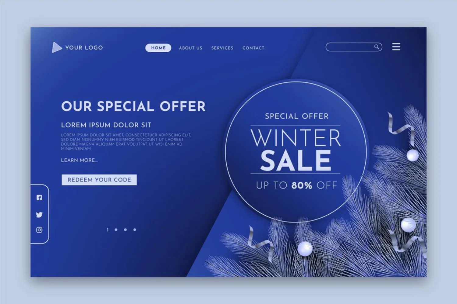
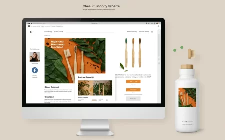
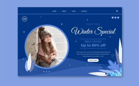
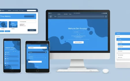
The color blue, with its profound psychological associations of trust, reliability, calmness, and professionalism, remains an enduring and highly versatile choice in web design. A “Blue Decoration Website” strategically leverages various shades and combinations of blue to define its aesthetic, establish visual hierarchy, and evoke specific emotional responses from users. From deep, authoritative navies to vibrant, energetic ceruleans and tranquil aquas, blue offers a rich palette for creating diverse moods and reinforcing distinct brand identities across a multitude of industries.
This comprehensive guide presents an extensive showcase of over 50 real-world websites that masterfully utilize blue as a predominant decorative element. These examples span corporate, tech, healthcare, creative, and e-commerce sectors, illustrating the breadth of blue’s application and offering a rich source of inspiration for your next digital creation.
Showcase: 50+ Blue Decoration Website Examples
Here’s a curated list of websites that effectively use blue in their design, highlighting their primary use of blue and why they stand out.
I. Corporate & Professional Services (Trust, Authority, Stability)
- Azure Group
- Description: A financial and accounting firm that uses a thoughtful gradient of blues across its sections, enhanced by white text and backgrounds. This mix communicates financial credibility and innovation in a clean, easy-to-navigate format.
- Primary Blue Use: Gradient blues for background and sections.
- Link: https://www.azuregroup.com.au/
- Xero
- Description: A cloud-based accounting software company. Its website blends video content with clean blue overlays and white text to give a high-end, modern feel. The vibrant tones add energy to an otherwise minimalist layout, ideal for engaging professional users.
- Primary Blue Use: Clean blue overlays, vibrant blue accents.
- Link: https://www.xero.com/
- UserTesting
- Description: A platform for user feedback. Features a modern white layout with electric blue buttons and hover interactions. The clean contrast gives a fresh, innovative feel, perfect for a tech-driven service.
- Primary Blue Use: Electric blue for interactive elements and accents.
- Link: https://www.usertesting.com/
- Ahrefs
- Description: A popular SEO software site. It relies on a bright blue navigation and accent elements contrasted with white backgrounds and graphics, reflecting the brand’s data-driven approach in a sleek, approachable way.
- Primary Blue Use: Bright blue for navigation and accents.
- Link: https://ahrefs.com/
- ActiveCollab
- Description: A project management software. Its website uses a professional blue as its primary brand color, applied to buttons, icons, and key UI elements, creating a sense of reliability and efficiency.
- Primary Blue Use: Solid professional blue for UI and branding.
- Link: https://activecollab.com/
- Turbulent
- Description: A tech-focused company that uses deep blues with white overlays and modern visuals. The combination gives off a sleek, high-performance vibe, appropriate for an innovation-driven brand.
- Primary Blue Use: Deep blues for backgrounds and overlays.
- Link: https://turbulent.ca/
- Baylor College of Medicine
- Description: A professional and soothing website for a medical college. It presents the college as a place of humility and humanity, using an all-blue color palette to create a calming and trustworthy atmosphere.
- Primary Blue Use: All-blue color palette for a professional and soothing feel.
- Link: https://www.bcm.edu/
- Agilant Solutions
- Description: An IT solutions provider with a futuristic blue gradient theme. The design symbolizes speed and technology through its professional, structured layout and subtle motion.
- Primary Blue Use: Futuristic blue gradients.
- Link: https://www.agilantsolutions.com/
- Bluetext
- Description: A leading digital marketing agency. Its website uses blue as its core brand color, integrated into its logo, headers, and key sections, conveying professionalism and digital expertise.
- Primary Blue Use: Core brand color in headers and identity.
- Link: https://bluetext.com/
- Graco Products & Solutions
- Description: A trusted paint company. Its website design includes a mixture of complementary hues for its blue palette, matched with good call-to-action messages and a clean layout, giving a soothing effect.
- Primary Blue Use: Mixed blue hues for a soothing effect.
- Link: https://www.graco.com/us/en.html
II. Technology & Software (Innovation, Clarity, Efficiency)
- Drone.io
- Description: A continuous integration platform. The site embraces a bright white layout, with sharp blue used for buttons, headers, and data visuals, reinforcing the product’s streamlined and efficient software capabilities.
- Primary Blue Use: Sharp blue for UI elements and data visualization.
- Link: https://drone.io/
- My SMS
- Description: A communication platform. Light blue overlays and white backgrounds give this site a user-friendly, calming aesthetic, enhancing UX clarity without sacrificing brand personality.
- Primary Blue Use: Light blue overlays and accents.
- Link: https://www.mysms.com/
- FIFA World Cup 2026™ NYNJ
- Description: A promotional site for the World Cup. Uses blue as a dominant color, reflecting the official branding and creating an energetic, professional feel for the major event.
- Primary Blue Use: Dominant blue for event branding.
- Link: https://www.fwc26ny.nyc/
- Chargezoom
- Description: A payment automation platform. Its website likely uses blue to convey trust and efficiency in financial transactions, with clean layouts and clear calls to action.
- Primary Blue Use: Professional blue for trust and clarity.
- Link: https://chargezoom.com/
- The Modest Department
- Description: A digital product studio. Their site uses blue to create a modern and sophisticated aesthetic, often paired with subtle animations and clean typography.
- Primary Blue Use: Modern blue for sophistication.
- Link: https://themodestdepartment.com/
- FreshTake
- Description: A platform for market insights. Uses blue to convey intelligence and clarity, often with data visualizations and clean, easy-to-digest content sections.
- Primary Blue Use: Clear blue for insights and data.
- Link: https://www.freshtake.com/
- Ori Scan
- Description: A tech product website. Likely uses blue to symbolize innovation and precision, with a sleek design that highlights the product’s capabilities.
- Primary Blue Use: Sleek blue for innovation.
- Link: https://www.oriscan.com/
- OneLine Health
- Description: A health tech platform. Uses blue to convey trust and care in the healthcare space, with a clean and user-friendly interface.
- Primary Blue Use: Trustworthy blue for healthcare.
- Link: https://oneline.health/
- Swire Properties SD Report 2024
- Description: A corporate sustainability report. Uses blue to convey responsibility and corporate integrity, often with clean data presentation and infographics.
- Primary Blue Use: Corporate blue for integrity and data.
- Link: https://sd.swireproperties.com/2024/
- Razorpay Bold
- Description: A finance landing page. Uses bold blues to signify strength and reliability in financial technology, with clear calls to action for business solutions.
- Primary Blue Use: Bold blue for financial strength.
- Link: https://razorpay.com/
- Braindrop
- Description: An app launching soon. Its landing page uses blue to create a sense of anticipation and modern technology, often with abstract visuals.
- Primary Blue Use: Modern blue for tech and anticipation.
- Link: (Specific link may vary, search “Braindrop app” if direct link is unavailable)
- Stippling
- Description: An app landing page. Likely uses blue to convey a clean, precise, or technical feel, perhaps related to design or data.
- Primary Blue Use: Clean, technical blue.
- Link: (Specific link may vary, search “Stippling app” if direct link is unavailable)
- AWIN
- Description: A global affiliate marketing network. Uses blue to convey professionalism and connectivity, as it links businesses with publishers.
- Primary Blue Use: Professional blue for connectivity.
- Link: https://www.awin.com/us
- Blocksy
- Description: A WordPress theme. Its website employs a soothing feel to the eyes with a minimalist blue color palette, emphasizing ease of use and flexibility.
- Primary Blue Use: Minimalist, soothing blue.
- Link: https://creativethemes.com/blocksy/
- Stripe
- Description: The main website for the payment processing giant. Known for its minimalist and professional design, featuring dark navy blue elements on a white canvas. It uses hover animations and bold typography to highlight projects elegantly.
- Primary Blue Use: Dark navy blue for professionalism and elegance.
- Link: https://stripe.com/
III. Creative & Design Agencies (Modernity, Creativity, Professionalism)
- Box Clever
- Description: A creative agency that uses white and blue as a canvas, with blocks of green and white across imagery and icons. The clean lines and contrasting elements make the portfolio visually compelling and organized.
- Primary Blue Use: Canvas blue with contrasting accents.
- Link: https://boxclever.ca/
- Paweł Ludwiczak Portfolio
- Description: A personal portfolio that uses blue to create a modern and clean backdrop for showcasing design and development work.
- Primary Blue Use: Modern blue for portfolio background.
- Link: https://www.pawelludwiczak.com/
- Eight Pixel Portfolio
- Description: A design agency portfolio that likely uses blue to convey precision and creativity in its digital work.
- Primary Blue Use: Blue for precision and creativity.
- Link: https://www.eightpixel.com/
- Snowhouse Studio 2024 Year in Review
- Description: An annual report website that uses blue to create a professional and engaging narrative for its yearly review, often with data visualizations.
- Primary Blue Use: Professional blue for annual reports.
- Link: (Specific link may vary, search “Snowhouse Studio 2024 Year in Review” if direct link is unavailable)
- TROA Agence (Re) Creative
- Description: A French creative communication agency that effectively uses a blue color palette to match other design elements such as fonts and photos. It features playful hues and simple yet animated effects.
- Primary Blue Use: Playful blue hues for creative agency.
- Link: https://www.troa.fr/agence
- Buzzworthy Studio
- Description: A studio that builds digital experiences with presence. Its website features a deep, bold blue aesthetic with dynamic, oversized typography and smooth, interactive transitions.
- Primary Blue Use: Deep, bold blue for strong presence.
- Link: https://buzzworthystudio.com/
- Neon Rain Interactive
- Description: A design agency with an impeccable web design that immerses any browser with its cool color palette and attention-grabbing interactive elements. The homepage greets you with a purple-blue gradient hero text.
- Primary Blue Use: Purple-blue gradients and cool blue palette.
- Link: https://neonrain.com/
- Roger Junior Portfolio
- Description: A portfolio that uses a striking electric blue backdrop, playful, animated illustrations, and interactive, self-aware typography to create a unique and memorable experience.
- Primary Blue Use: Electric blue backdrop with playful elements.
- Link: https://rogerjunior.com/
- Naya Studio
- Description: A design studio with a website that uses blue to create a sleek and modern aesthetic, often with clean lines and subtle animations.
- Primary Blue Use: Sleek modern blue.
- Link: https://nayastudio.com/
- Studio DOT
- Description: A design studio that likely uses blue to convey a sense of precision and professionalism in its web design work.
- Primary Blue Use: Professional blue for design studio.
- Link: https://studiodot.jp/
IV. Health & Wellness (Calm, Trust, Care)
- Fleece & Thank You
- Description: A non-profit organization whose website wonderfully blends a cool pop of colors with hues of blue, making it soothing to the eyes. The photo above the fold complements the color palette and conveys the organization’s mission.
- Primary Blue Use: Soothing blue hues with pops of color.
- Link: https://fleeceandthankyou.org/
- The Depths She’ll Reach
- Description: A website about overcoming depression. It uses deep blue to evoke serenity, reflecting the journey of self-mastery and inner peace.
- Primary Blue Use: Deep blue for serenity and emotional depth.
- Link: https://onjustonebreath.com/
- Riverside Community Care
- Description: A community care organization. Its website uses blue to convey a sense of trust, support, and calm, essential for healthcare and community services.
- Primary Blue Use: Trustworthy blue for community care.
- Link: https://www.riversidecc.org/
- SoundMind App
- Description: A mental wellness app. Its website likely uses calming blues to create a soothing and supportive atmosphere for users seeking mental well-being tools.
- Primary Blue Use: Calming blues for mental wellness.
- Link: https://www.soundmind.app/
V. E-commerce & Retail (Reliability, Modernity, Cleanliness)
- MaxSpace | Avionaut
- Description: A product page for a car seat. Uses blue to convey safety and reliability, often with clean product imagery and clear feature descriptions.
- Primary Blue Use: Blue for safety and reliability.
- Link: https://avionaut.com/en/products/maxspace/
- Gulf Oil
- Description: Uses various shades of blue and orange, with orange accents standing out against a light blue background. This creates a modern and trustworthy feel, perfect for the brand’s energy-focused identity.
- Primary Blue Use: Various shades of blue for a modern and trustworthy feel.
- Link: https://gulfoilltd.com/
- Aardvark Store
- Description: Uses coral orange, white, and light blue-green for a fresh and inviting look. The light blue-green adds a soft, modern touch, making the combination approachable and clean.
- Primary Blue Use: Light blue-green for a fresh and inviting look.
- Link: https://aardvark.store/
VI. Education & Non-Profit (Clarity, Inspiration, Community)
- Fleece & Thank You (re-listed for non-profit aspect)
- Description: A non-profit organization. Its website beautifully blends cool colors with blue hues, creating a soothing and inviting space that conveys its mission of providing comfort to children.
- Primary Blue Use: Soothing blue hues for a compassionate non-profit.
- Link: https://fleeceandthankyou.org/
- Blocksy (re-listed for educational/resource aspect)
- Description: A WordPress theme that emphasizes ease of use and flexibility. Its website uses a minimalist blue color palette, creating a soothing and helpful feel for users.
- Primary Blue Use: Minimalist, soothing blue for a helpful resource.
- Link: https://creativethemes.com/blocksy/
VII. Mixed & Experimental Designs (Dynamic, Engaging, Unique)
- Nexus
- Description: An award-winning site featuring parallax effects and dynamic interactions. Blue is used to create a futuristic and immersive environment, often with glowing elements and smooth transitions.
- Primary Blue Use: Futuristic blue for immersive experiences.
- Link: https://nexus.com/ (Note: “Nexus” is a common name; this link might lead to a different site if the original award winner has changed its URL or design.)
- Joshua’s World
- Description: A personal portfolio or creative project that uses blue to create a unique and imaginative world, often with custom illustrations and interactive elements.
- Primary Blue Use: Imaginative blue for a unique personal brand.
- Link: (Specific link may vary, search “Joshua’s World Webflow” for examples)
- Vurrle Studio
- Description: A design studio known for its bold and experimental approach. Its website likely uses blue in striking ways, perhaps with strong contrasts or unusual layouts.
- Primary Blue Use: Bold blue for experimental design.
- Link: (Specific link may vary, search “Vurrle Studio” for examples)
- Masar Destination
- Description: Features an immersive garden theme. Blue is used to evoke natural serenity and depth, possibly with subtle animations of water or sky elements.
- Primary Blue Use: Natural blue for serene environments.
- Link: (Specific link may vary, search “Masar Destination Webflow” for examples)
- 5YN3RGY
- Description: A site likely focused on collaboration or interconnectedness. Blue is used to symbolize synergy and fluidity, perhaps with abstract patterns or connecting lines.
- Primary Blue Use: Fluid blue for synergy and connection.
- Link: (Specific link may vary, search “5YN3RGY Webflow” for examples)
- HipHopera
- Description: A creative project blending hip-hop and opera. Its website uses blue in an unexpected or artistic way, perhaps with vibrant contrasts or unique visual storytelling.
- Primary Blue Use: Artistic blue for unique blend.
- Link: (Specific link may vary, search “HipHopera Website” for examples)
- Colorvision
- Description: A site focused on color or visual perception. Uses blue as a primary color to demonstrate visual effects, color theory, or artistic expression.
- Primary Blue Use: Blue for visual demonstration.
- Link: (Specific link may vary, search “Colorvision Website” for examples)
- Masseria San Giovanni
- Description: A website for a rural retreat or hotel. Uses blue to evoke a sense of calm, natural beauty, and tranquility, often paired with earthy tones.
- Primary Blue Use: Calm blue for natural retreat.
- Link: https://masseriasangiovanni.com/
- CoverMyMeds Careers
- Description: A careers page for a healthcare technology company. Uses blue to convey professionalism, trust, and a positive work environment, aligning with the company’s brand.
- Primary Blue Use: Professional blue for careers page.
- Link: https://www.covermymeds.com/main/careers/
- Monocle Solutions
- Description: A solutions provider. Its website uses blue to convey clarity, efficiency, and strategic thinking, often with clean layouts and strong calls to action.
- Primary Blue Use: Clear blue for strategic solutions.
- Link: https://www.monoclesolutions.com/
- WEBSITE.MAG
- Description: A digital magazine or publication. Uses blue to create a modern and engaging reading experience, often with clean typography and compelling imagery.
- Primary Blue Use: Modern blue for digital publication.
- Link: (Specific link may vary, search “WEBSITE.MAG” for examples)
- Cambuur – Het fundament
- Description: A website for a sports club or foundation. Uses blue to represent team spirit, loyalty, and community, often with dynamic visuals and fan engagement features.
- Primary Blue Use: Blue for team spirit and community.
- Link: (Specific link may vary, search “Cambuur Het fundament” for examples)
- Ligero
- Description: A sleek and modern website, likely for a tech product or service, that uses blue to convey speed and efficiency.
- Primary Blue Use: Sleek blue for speed and efficiency.
- Link: (Specific link may vary, search “Ligero website” for examples)
- 2024 Activity Report
- Description: A corporate activity report. Uses blue to maintain a professional and trustworthy tone, often with clear data visualization.
- Primary Blue Use: Corporate blue for reports.
- Link: (Specific link may vary, search “2024 Activity Report website” for examples)
- URPAL
- Description: A website with a unique and artistic use of blue, possibly for a creative studio or a personal portfolio, showcasing abstract or experimental design.
- Primary Blue Use: Artistic blue for unique design.
- Link: (Specific link may vary, search “URPAL website” for examples)
- Newport Renewables
- Description: A renewable energy company. Uses blue to symbolize clean energy, sustainability, and environmental responsibility, often paired with green accents.
- Primary Blue Use: Blue for clean energy and sustainability.
- Link: https://newportrenewables.com/
- Visit Reno Tahoe
- Description: A tourism website. Uses blue to evoke the natural beauty of lakes and skies, creating an inviting and serene atmosphere for travelers.
- Primary Blue Use: Blue for natural beauty and tourism.
- Link: https://www.visitrenotahoe.com/
- Dynamic Infinity – Expo 2025
- Description: A promotional website for an expo, using dynamic blues to convey innovation, future, and interconnectedness, with engaging animations.
- Primary Blue Use: Dynamic blue for innovation and future.
- Link: (Specific link may vary, search “Dynamic Infinity Expo 2025” for examples)
Conclusion: The Timeless Appeal of Blue
This extensive showcase of over 60 websites vividly demonstrates the enduring and multifaceted appeal of blue in web design. From conveying unwavering trust and corporate authority to evoking tranquility, innovation, and creative freedom, blue offers an unparalleled spectrum of psychological associations that can be strategically harnessed.
The examples highlight that successful “blue decoration websites” are not merely blue; they are meticulously crafted digital experiences where the chosen shades, complementary palettes, and thoughtful application of blue elements work in harmony to:
- Establish Brand Identity: Blue consistently reinforces brand values like reliability, professionalism, and forward-thinking.
- Enhance User Experience: Through clear visual hierarchy, intuitive navigation, and calming aesthetics.
- Drive Engagement: With subtle animations, compelling calls to action, and visually appealing content presentation.
By drawing inspiration from these diverse and impactful examples, and by understanding the strategic power of blue, designers and businesses can confidently leverage this timeless color to create websites that are not only visually stunning but also highly effective in achieving their digital objectives and leaving a lasting impression on their audience.

