

In the vast digital landscape, where attention spans are fleeting, a website’s visual appeal is paramount. While clean, minimalist designs have their place, nothing quite captures the imagination and leaves a lasting impression like stunning colorful websites. These vibrant digital spaces don’t just look good; they strategically leverage the power of color to evoke emotion, guide user journeys, and forge unforgettable brand identities. Far from being a chaotic mess, a well-executed colorful website is a testament to thoughtful design, blending artistic flair with deep understanding of user psychology.
This guide will dive into the magic behind these visually rich platforms, exploring why color is such a potent design tool, the principles that underpin truly effective colorful web design, and showcase inspiring examples that master the art of chromatic brilliance. Whether you’re a designer seeking inspiration or a business owner looking to inject personality into your online presence, understanding the strategic use of color can elevate your website from ordinary to extraordinary.
The Power of Color in Web Design
Color is more than just decoration; it’s a fundamental element of visual communication. In web design, color plays a critical role in shaping user perception, influencing mood, and directing attention. The human brain processes colors before it processes text, making them an immediate and powerful tool for conveying messages and creating an emotional connection.
Evoking Emotion and Brand Identity
Every color carries psychological associations that can profoundly impact how users feel about a brand or a website.
- Warm Colors (Reds, Oranges, Yellows): These colors are often associated with energy, passion, excitement, and warmth. They can create a sense of urgency or draw immediate attention. For instance, a vibrant orange on a call-to-action button can encourage clicks.
- Cool Colors (Blues, Greens, Purples): These hues typically evoke feelings of calm, trust, stability, and professionalism. Blues are frequently used by tech companies and financial institutions to build credibility, while greens often signify nature, growth, or health. Purples, as discussed in a previous blog, can convey luxury, creativity, and mystery.
- Neutrals (Grays, Whites, Blacks): These provide balance and sophistication. They allow vibrant colors to pop and create a sense of spaciousness and clarity, ensuring that the colorful elements don’t overwhelm the user.
By strategically combining these, stunning colorful websites can craft a unique emotional landscape that resonates with their target audience, reinforcing brand values and creating a memorable experience.
Enhancing User Experience and Navigation
Beyond aesthetics, color is a powerful functional tool in web design. It can significantly enhance user experience (UX) and guide navigation.
- Visual Hierarchy: Colors can differentiate elements and establish a clear visual hierarchy. Brighter, more saturated colors naturally draw the eye, making them ideal for primary calls-to-action or important information.
- Feedback and States: Color changes provide instant feedback to users. For example, a button changing color on hover, a form field turning red for an error, or green for success, immediately communicates status without requiring text.
- Brand Recognition: Consistent use of a specific color palette across a website and other brand touchpoints builds strong brand recognition. Users begin to associate certain colors with your brand, fostering familiarity and trust.
- Accessibility: Thoughtful color choices also contribute to accessibility. Ensuring sufficient color contrast is vital for users with visual impairments, making the content readable and the website usable for everyone.
Principles for Creating Stunning Colorful Websites
Achieving a truly stunning colorful website isn’t about throwing every color onto the page. It requires a strategic approach, blending artistic intuition with established design principles.
Understanding Color Theory Basics
A foundational understanding of color theory is paramount.
- Color Wheel: Familiarize yourself with the color wheel to understand relationships between colors (complementary, analogous, triadic, monochromatic).
- Color Harmonies:
- Complementary: Colors opposite each other (e.g., blue and orange) create high contrast and vibrancy. Use them sparingly for emphasis.
- Analogous: Colors next to each other (e.g., blue, blue-green, green) create a harmonious and serene feel.
- Triadic: Three colors evenly spaced on the color wheel (e.g., red, yellow, blue) offer strong visual contrast while maintaining balance.
- Monochromatic: Different shades, tints, and tones of a single color create a subtle, elegant, and cohesive look.
- Saturation and Brightness: Adjusting these properties can dramatically change a color’s impact. A highly saturated color is intense, while a desaturated one feels muted. Brightness dictates how light or dark a color appears.
Balancing Vibrancy with Readability
While aiming for a colorful design, never compromise on readability.
- Background vs. Foreground: Ensure sufficient contrast between text and its background. Dark text on a light colorful background or light text on a dark colorful background usually works best. Tools like WebAIM Contrast Checker can help verify contrast ratios.
- Limited Palette for Core Elements: Even on a highly colorful site, it’s wise to limit the number of colors used for essential elements like primary navigation, body text, and calls-to-action. This maintains clarity and prevents visual clutter.
- Strategic Use of White Space: Ample white space (or negative space) is crucial. It gives the eye a place to rest and prevents the colorful elements from feeling overwhelming. It acts as a visual buffer.
Consistency and Brand Cohesion
A successful colorful website maintains consistency in its color application to reinforce brand identity.
- Define a Primary Palette: Establish a core set of 3-5 colors that represent your brand. These colors should be used consistently across your website, marketing materials, and social media.
- Accent Colors: Use accent colors sparingly to highlight important information or interactive elements. These should complement your primary palette without clashing.
- Thematic Consistency: If your website has different sections or themes, use color to subtly differentiate them while maintaining overall brand cohesion. For example, a vibrant e-commerce site might use a different accent color for each product category.
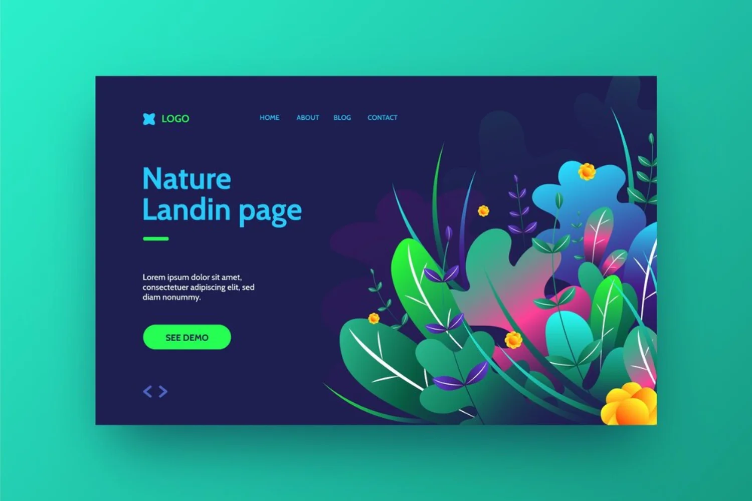
Examples of Stunning Colorful Websites
To truly understand the impact of strategic color use, let’s look at some exemplary stunning colorful websites that leverage vibrant palettes to create memorable and effective user experiences.
- Stripe: While their main site is clean, many of their product pages and illustrations use vibrant, gradient-rich colors to explain complex financial concepts in an engaging and approachable way.
- Spotify: Known for its dynamic and often colorful branding, Spotify uses bold gradients and contrasting colors in its app and web interface to highlight music, playlists, and user moods.
- Mailchimp: Their playful use of yellow and purple, combined with quirky illustrations, makes email marketing feel approachable and fun, breaking away from traditional corporate aesthetics.
- Canva: As a design tool, Canva itself is a masterclass in color. Its interface is bright and inviting, using a wide spectrum of colors to categorize tools and inspire creativity without feeling overwhelming.
- Figma: This collaborative design tool uses a clean base with strategic pops of vibrant colors and gradients to differentiate features and enhance the user’s creative flow.
- Discord: Its iconic purple, combined with blues and greens, creates a friendly, community-focused vibe that is instantly recognizable and appealing to its user base.
- Adobe Creative Cloud: Each Adobe application (Photoshop, Illustrator, etc.) has its own distinct color identity (e.g., blue for Photoshop, orange for Illustrator), yet they all fit within a cohesive, vibrant ecosystem.
- Awwwards: This website showcases the best in web design, and often features sites that push the boundaries of color use, serving as a constant source of inspiration for vibrant aesthetics.
- Dribbble: A platform for designers to share their work, Dribbble itself uses a bright, inviting color palette and is filled with examples of designers experimenting with bold and beautiful color schemes.
- Headspace: While calming, Headspace uses a range of soft, pastel colors in its illustrations and animations to create a gentle, inviting, and visually appealing experience for meditation.
- Calm: Similar to Headspace, Calm uses serene blues and purples, but often incorporates subtle, shifting gradients and colorful illustrations to enhance the feeling of tranquility.
- The New York Times (some interactive features): While its core site is monochrome, NYT’s interactive data visualizations and special reports often burst with vibrant, well-chosen color palettes to make complex information digestible and engaging.
- Google (various products): Google’s brand identity is inherently colorful, and many of its products (e.g., Google Arts & Culture, Google Doodles) leverage bright, diverse palettes to create playful and engaging experiences.
- Lyft: Uses a distinctive pink/purple hue that makes it instantly recognizable and conveys a friendly, modern, and accessible ride-sharing service.
- Squarespace (some templates): Many of Squarespace’s modern templates feature bold color blocks and gradients, allowing users to create visually striking websites with ease.
- Wix (some templates): Similar to Squarespace, Wix offers a plethora of templates that embrace vibrant colors and dynamic layouts, catering to a wide range of creative and business needs.
- Fantasy.co (A creative agency portfolio): Many top-tier design agencies use their own websites to showcase their creative prowess, often employing bold colors, striking gradients, and innovative layouts to impress potential clients.
- Saatchi Art (An online art gallery): Websites showcasing art often use rich, diverse color palettes to complement the artwork itself, creating an immersive and visually stimulating experience.
- ABCmouse.com (A children’s educational platform): These sites frequently use bright, primary, and secondary colors to create a fun, engaging, and stimulating environment for young learners.
- ASOS (A vibrant e-commerce fashion brand): Fashion brands often use bold, trendy color palettes to reflect their seasonal collections and appeal to a style-conscious audience.
- Uber Eats (A food delivery service): While their primary branding might be specific, their app often uses vibrant colors for food categories, promotions, and status updates to create a lively and intuitive experience.
- Booking.com (A travel booking site): While their core is functional, many travel sites use bright, inviting colors in destination imagery and promotional banners to evoke excitement and wanderlust.
- IGN (A gaming website): Gaming sites often feature dynamic, high-contrast, and often neon-infused color schemes to match the energetic and immersive nature of video games.
- Coachella (A music festival website): These sites typically use wild, eclectic, and highly saturated color palettes to convey the excitement, diversity, and artistic freedom of the event.
- Jessica Hische (A digital illustration portfolio): Illustrators often design their portfolios to be as colorful and expressive as their work, using unique palettes to showcase their artistic style.
- Minimalist Baker (A healthy food blog): These blogs often use fresh, natural greens, yellows, and earthy tones, sometimes with vibrant accents from fruits and vegetables, to create an appetizing and wholesome feel.
- Debbie Millman (A personal branding website for a creative professional): Designers, photographers, or artists often use a distinctive, colorful palette to make their personal brand stand out and reflect their unique style.
- Charity: Water (A non-profit organization’s awareness campaign): Colorful, hopeful palettes can be used to draw attention to important causes and evoke positive emotions, encouraging engagement and support.
- Apple (A product launch page for an innovative gadget): Tech companies often use sleek, modern designs with vibrant, futuristic color accents to highlight cutting-edge features.
- The Verge (An online magazine or editorial platform): Many modern online publications use bold color schemes in their layouts, typography, and imagery to create a distinct visual identity and enhance readability.
These examples highlight that a stunning colorful website isn’t limited to a single industry or style; it’s about intelligent and intentional application of color to achieve specific design and business goals.
Tools for Crafting Your Colorful Masterpiece
Creating your own stunning colorful website is made easier with the right tools. These resources can help you generate, test, and implement effective color palettes.
- Coolors: A super-fast color palette generator that allows you to create, save, and export harmonious color schemes. You can lock colors you like and generate new ones around them.
- Adobe Color: A powerful online tool that helps you explore color harmonies, create custom palettes from scratch, or extract colors from images. It integrates well with Adobe’s design software.
- Canva Color Palette Generator: Simple to use, this tool allows you to upload an image and instantly generates a color palette from it, perfect for matching website colors to existing brand assets.
- Paletton: A classic color scheme designer that enables you to pick a base color and then generate monochromatic, analogous, complementary, or triadic palettes around it, with fine-tuning options.
- Color Hunt: A curated collection of beautiful color palettes, updated daily. It’s a great source for inspiration and finding trending color combinations.
- WebAIM Contrast Checker: Essential for ensuring accessibility, this tool helps you check the contrast ratio between text and background colors to meet WCAG guidelines.
Common Pitfalls to Avoid
While aiming for a stunning colorful website, it’s easy to fall into common traps that can detract from the user experience.
- Keyword Stuffing: While “stunning colorful website” is our focus keyword, avoid overusing it in an unnatural way. The content should flow organically and provide value.
- Overwhelming the User: Too many bright, clashing colors without sufficient balance or white space can lead to visual fatigue and confusion. A colorful site should be vibrant, not chaotic.
- Poor Readability: If your color choices make text difficult to read, your message will be lost. Always prioritize contrast and legibility.
- Inconsistency: Randomly applying colors across different pages or elements makes a website look unprofessional and can confuse users about your brand identity.
- Ignoring Accessibility: Failing to meet contrast standards excludes users with visual impairments, limiting your audience and potentially leading to a poor user experience for many.
- Writing for Bots, Not Humans: Remember that the primary goal is to create an engaging and informative experience for human visitors. While SEO is important, it should never come at the expense of natural language and valuable content.
Conclusion
Creating a stunning colorful website is an art form that blends creativity with strategic design principles. By understanding the psychology of color, applying fundamental color theory, and drawing inspiration from successful examples, you can craft a digital space that not only captivates the eye but also effectively communicates your brand’s message and enhances the user journey. Color is a powerful tool in your design arsenal; when wielded thoughtfully, it can transform an ordinary website into an unforgettable visual experience. Embrace the spectrum, experiment with palettes, and let your website shine with vibrant personality.
Ready to infuse your website with a burst of color and personality? Explore our other web design guides for more insights, or contact us for expert consultation on creating a truly stunning and colorful online presence!
Frequently Asked Questions (FAQs)
Q1: What defines a “stunning colorful website”?
A stunning colorful website is one that uses a vibrant and diverse color palette in a strategic, harmonious, and aesthetically pleasing way. It leverages color not just for decoration, but to enhance readability, guide user navigation, evoke specific emotions, and reinforce brand identity, all without overwhelming the user.
Q2: How can I choose the right color palette for my website?
Start by considering your brand’s personality and target audience. Research color psychology to understand emotional associations. Use online tools like Coolors or Adobe Color to generate harmonious palettes based on color theory (complementary, analogous, triadic). Test different combinations to see what resonates best with your message.
Q3: Is a colorful website always better than a minimalist one?
Not necessarily. The “best” design depends on your brand, industry, and target audience. A colorful website is excellent for creative industries, entertainment, or brands wanting to convey energy and playfulness. Minimalist designs are often preferred for corporate, luxury, or content-heavy sites where clarity and sophistication are paramount. Both can be stunning when executed well.
Q4: How do I ensure my colorful website is still user-friendly?
Prioritize readability by ensuring high contrast between text and background. Use white space generously to prevent visual clutter. Limit the number of vibrant colors for core UI elements like navigation and calls-to-action. Maintain consistency in your color scheme across the site, and always test your design on various devices and with different users.
Q5: What are some common mistakes to avoid when designing a colorful website?
Common mistakes include using too many clashing colors, sacrificing readability for vibrancy, inconsistent color application, neglecting accessibility standards (especially contrast ratios), and allowing color to overwhelm the content. The key is balance and intentionality in every color choice.
Q6: Can a colorful website be professional?
Absolutely. Professionalism isn’t solely defined by a monochrome palette. Many tech companies, creative agencies, and even some financial institutions use vibrant colors strategically to convey innovation, approachability, and a modern edge while maintaining a professional appearance. The key is thoughtful application and high-quality design execution.
Q7: How does color impact SEO for a website?
Directly, color doesn’t impact SEO rankings. However, indirectly, it plays a significant role in user experience (UX) and engagement. A visually appealing and user-friendly colorful website can lead to lower bounce rates, longer session durations, and higher engagement, all of which are positive signals to search engines. Good UX, partly driven by effective color use, contributes to better SEO performance.


![iPhone Screen Size & Resolution | All iPhone Display Sizes Guide [2025]](https://neefox.com/wp-content/uploads/elementor/thumbs/iPhone-Screen-Size-Resolution-All-iPhone-Display-Sizes-Guide-2025-rgmkelp2h92gpnmfqsmjdkahpn01tobstqqhbrcigg.png "_iPhone Screen Size & Resolution All iPhone Display Sizes Guide [2025]")

