In today’s dynamic event landscape, a conference website is far more than just an online brochure; it’s the central hub for information, engagement, and community building. The best conference websites are meticulously designed digital experiences that captivate potential attendees, provide seamless access to vital information, and foster a sense of excitement and connection long before the event even begins. From showcasing keynote speakers and detailed agendas to facilitating registrations and virtual participation, an effective conference website is crucial for attracting the right audience and ensuring a memorable experience.
This comprehensive guide will delve into the essential characteristics that define a top-tier conference website. We’ll explore the strategic elements that make these sites impactful, highlight key design trends, provide actionable advice on building your own, and showcase inspiring examples from leading events that master the art of digital engagement. Whether you’re organizing a small industry gathering or a large-scale international summit, understanding these best practices is vital for driving attendance and delivering a successful conference.
Why a Superior Conference Website is Essential
In an increasingly digital world, your conference website is often the first, and most critical, touchpoint with potential attendees. Its quality directly impacts perception, registration rates, and overall event success. Here’s why a superior online presence is non-negotiable:
- First Impressions & Credibility: A professional, well-designed website immediately establishes credibility and sets the tone for the quality of the conference.
- Information Hub: It serves as the primary source for all event-related details, accessible 24/7, reducing inquiries and improving attendee preparedness.
- Attendee Acquisition: A compelling website is a powerful marketing tool, converting interested visitors into registered attendees through clear calls-to-action and persuasive content.
- Enhanced Engagement: Features like speaker profiles, detailed agendas, and interactive elements keep potential attendees engaged and excited about the event.
- Sponsor & Exhibitor Value: A professional website provides a strong platform to showcase sponsors and exhibitors, demonstrating value and attracting future partnerships.
- Seamless Registration: An integrated and user-friendly registration system is crucial for a smooth sign-up process, minimizing friction and abandonment.
- Virtual & Hybrid Event Support: For online or blended events, the website is the gateway to virtual platforms, streaming content, and interactive sessions.
Key Features of the Best Conference Websites
What sets the best conference websites apart? It’s a blend of stunning design, robust functionality, and a user-centric approach that anticipates attendee needs.
- Compelling Visual Design & Branding:
- Clean, Modern Layout: An uncluttered design that is easy to navigate and visually appealing.
- Consistent Branding: Reflects the conference theme and brand identity through color palettes, typography, and imagery.
- High-Quality Visuals: Engaging hero sections, dynamic video backgrounds, and professional photography that create an immersive experience.
- Interactive Elements: Subtle animations, hover effects, and clickable timelines to enhance engagement.
- Clear & Intuitive Navigation:
- Simple Menu Structure: Easy-to-understand main categories (e.g., “Agenda,” “Speakers,” “Register,” “Venue,” “Sponsors”).
- Sticky Navigation: Keeps the menu accessible as users scroll down the page.
- Search Functionality: For large conferences, a search bar helps users quickly find specific sessions or speakers.
- Comprehensive Content Sections:
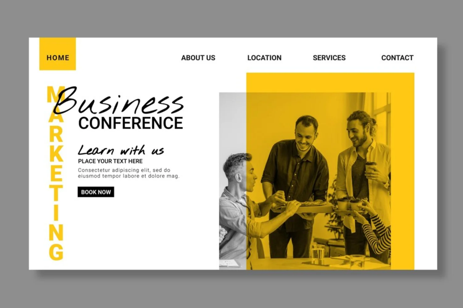
- Hero Section: Prominently displays the conference name, dates, location (or virtual nature), and a compelling tagline with a clear Call-to-Action (CTA).
- About/Info Section: A concise overview of the conference’s purpose, mission, and target audience.
- Detailed Agenda/Schedule: A well-structured, easy-to-read schedule of sessions, workshops, and activities, including speaker names, topics, and times. Ideally, this is filterable and customizable.
- Speaker Profiles: Professional photos, bios, and links to social media or personal websites for each speaker. For keynote speakers, give them pride of place on the homepage.
- Registration & Ticketing: Clear instructions on how to register, ticket types, pricing, early bird discounts, payment methods, and any terms & conditions. The process should be seamless and embedded if possible.
- Venue Information: For in-person events, detailed information including address, map, directions, accommodation options, and local attractions.
- Sponsors & Partners: Prominent display of sponsor logos with links, acknowledging their support and providing value.
- FAQ Section: A comprehensive list of frequently asked questions to reduce common inquiries (e.g., parking, accessibility, Wi-Fi).
- News/Blog Section: Regular updates, announcements, preparation tips, and post-event summaries to keep the content fresh and engage attendees.
- Photo/Video Gallery: Highlights from past events, testimonials, and sizzle reels to build excitement and social proof.
- Robust Functionality & Performance:
- Mobile Responsiveness: Adapts seamlessly to all devices (desktop, tablet, smartphone) for optimal viewing and interaction.
- Fast Loading Times: Optimized for speed to prevent bounce rates and improve user experience.
- SEO Optimization: Proper use of keywords, meta descriptions, and clean URLs to ensure high visibility in search engine results.
- Social Media Integration: Easy sharing buttons and links to the conference’s social media profiles to amplify reach.
- Data Security: SSL certificates, secure payment gateways, and clear privacy policies to protect attendee data.
- Analytics Integration: Tools to track website traffic, user behavior, and conversion rates for continuous improvement.
Inspiring Examples: Leading Conference Websites in Action
Let’s look at some of the best conference websites that exemplify effective online strategies, blending design, content, and functionality to create impactful digital experiences.
Tech & Innovation Conferences
- Web Summit Vancouver: Features a clean, modern design with bold visuals and vibrant imagery, excellent use of white space, and a simple color palette. Known for its professional and engaging vibe.
- VueJS Amsterdam: Bold and visually engaging, with strong typography, dynamic parallax visuals, and clear calls to action. Highlights speaker bios and event details effectively.
- Phocuswright Conference: Sleek, professional design focusing on clean navigation, bold imagery, and clear CTAs. Emphasizes event themes, speaker profiles, and networking opportunities in travel innovation.
- GOTO Chicago 2024: Features a memorable web layout and a simple, clean design with a nice header section.
- Collision: Described as bold, contrasting, and confident, its website effectively showcases a major tech conference that attracts a vast international audience.
- The Next Web Conference: Formal yet lighthearted, bringing together local and international tech experts with an innovative website design.
- Adobe Summit: A digital marketing conference with a website featuring keynote speeches, training sessions, and a professional layout.
- Dreamforce (Salesforce): Salesforce’s annual event, offering hands-on workshops and training sessions, with a website that effectively manages a massive amount of content and attendee engagement.
- Google Cloud Next: Brings together developers, IT professionals, and business leaders, with a website that provides comprehensive information on sessions and learning opportunities.
- CES Tech Event: The biggest tech show, its website uses colorful images and a clear menu with visible CTAs to grab attention and provide easy navigation.
Design & Creative Conferences
- AIGA Design Conference: Showcases a sleek, accessible design with event details, themes, and a focus on creativity and innovation, exploring diverse perspectives.
- Canvas Conference: Features a sleek and modern design tailored for an event focused on design, creativity, and collaboration, offering clean navigation and visually engaging content.
- Design Thinkers: Known for its bright colors and dynamic visual elements that instantly grab attention, often with interactive registration options.
- Awwwards Conference: As a platform recognizing web design excellence, their conference website is naturally cutting-edge, showcasing innovative design and development.
- Circles: A design conference website known for its appealing visuals and informative text that successfully attracts visitors and reassures them about joining.
Industry-Specific & Specialized Conferences
- E-commerce Conference (MK): Features a modern, professional layout with bold visuals and intuitive navigation, emphasizing speaker profiles and evolving e-commerce trends.
- Chargebee (User Conference): Highlights a virtual event focused on change, innovation, and growth for subscription businesses with an awesome and fun design.
- Climate Conference (Weblium Template Example): This template example is perfect for scientific conferences, packing key details into an engaging layout with easy-to-digest information and visuals.
- Defence in Space Conference (Weblium Template Example): Nails a futuristic design matching its focus on advanced technology, with an easy-to-navigate agenda and interactive registration tools.
- UITP Summit: Blends modern design with in-depth content for sustainable urban mobility solutions, using dynamic visuals of the host city and easy navigation for attendees.
- RSA Conference: Gives innovative vibes with a black background and contrasting colors, featuring interactive tools like agenda customization and on-demand resources.
- The Health 2.0 Conference: Tailored for healthcare professionals, with a clean and professional design that prioritizes functionality and organizes extensive content into categories.
- European Food Summit: Places a spotlight on culinary pioneers, ensuring visuals evoke the event’s atmosphere, whether showcasing culinary delights or past event moments.
- HRX: Features a clean and dynamic design focusing on innovation and collaboration in healthcare, highlighting key event details like seminar topics and dates.
- International Publishers Congress: Effectively combines functionality and web design with a straightforward layout and top navigation menu for essential information.
Virtual Conference Platforms (Often with Exemplary Websites)
- Cvent Virtual Conference Platform: Known for its robust platform that combines data, experience, and technology to create amazing virtual conferences online, with features for attendee personalization and sponsor ROI.
- vFairs Virtual Conference Platform: Hosts interactive virtual conferences of any size, offering highly customizable platforms with digital booths, webinars, breakout rooms, and robust networking tools.
- ON24 Virtual Conference Platform: Empowers users to scale audience reach, maximize engagement, and build community with features like content translation, personalized engagement tools, and actionable insights.
- Zoom (for virtual events): While primarily a video conferencing tool, Zoom’s event solutions page highlights how its platform supports virtual conferences with features for productivity, flexible workspaces, and AI integration.
- Webflow (Conference Templates): Showcases various conference website templates built by the Webflow community, offering inspiration for modern, responsive, and visually appealing designs.
These examples demonstrate that the best conference websites are thoughtfully designed to inform, engage, and convert, providing a seamless experience for all stakeholders.
Tools for Building Your Best Conference Website
Creating a high-impact conference website is more accessible than ever, thanks to specialized event platforms and versatile website builders.
- Event Management Platforms with Website Builders:
- Wix Events: Offers customizable templates specifically for events and conferences, with integrated registration and ticketing.
- Ex Ordo: A comprehensive platform for academic conferences, including tools for website design, abstract management, and registration.
- EventsAir: Provides a robust event management system with features for building high-impact event websites, including agenda management and speaker profiles.
- vFairs: Specializes in virtual and hybrid event platforms, offering customizable websites with interactive features like virtual booths and networking.
- Cvent: A leading event technology company offering solutions for event websites, registration, and virtual event platforms.
- CONREGO: An event management software with a built-in CMS for creating responsive and functional conference websites.
- General Website Builders (with event-specific features/templates):
- Squarespace: Known for its beautiful, design-forward templates, suitable for creating visually appealing conference sites.
- WordPress (with themes like Eventbrite, Divi, Elementor): Offers immense flexibility and a vast ecosystem of plugins for event management, registration, and ticketing.
- Webflow: A powerful design tool for creating highly custom and responsive websites, popular among designers for its visual development capabilities.
- Content & Marketing Tools:
- High-Quality Photography & Videography: Essential for capturing the essence of your event and enticing attendees.
- Email Marketing Platforms (e.g., Mailchimp, HubSpot): For pre-event promotions, registration confirmations, and post-event follow-ups.
- Social Media Management Tools: For promoting the conference and engaging with attendees across platforms.
- Analytics Tools (e.g., Google Analytics): To track website traffic, user behavior, and conversion rates.
Frequently Asked Questions (FAQs)
Q1: What is the most crucial element for a conference website’s homepage?
The most crucial element for a conference website’s homepage is a compelling hero section that immediately communicates the event name, dates, location (or virtual nature), a powerful tagline, and a prominent Call-to-Action (CTA) like “Register Now.” This ensures visitors quickly grasp the event’s essence and know how to proceed.
Q2: How important is mobile responsiveness for a conference website?
Extremely important. A significant portion of potential attendees will access your conference website from their smartphones or tablets. A mobile-responsive design ensures that the site looks and functions flawlessly on all devices, providing a positive user experience and preventing frustration.
Q3: Should a conference website include the full agenda?
Yes, absolutely. A detailed and well-structured agenda or schedule is a critical feature. It allows potential attendees to understand the value proposition, plan their participation, and see the breadth of topics and speakers. Ideally, the agenda should be interactive, filterable, and easy to navigate.
Q4: How can a conference website effectively showcase its speakers?
To effectively showcase speakers, the website should include:
- Professional headshots.
- Concise, engaging biographies highlighting their expertise and relevance.
- Links to their social media profiles or personal websites.
- Details about the sessions they will be presenting.
- For keynote speakers, consider giving them prominent placement on the homepage.
Q5: What are some best practices for the registration process on a conference website?
Best practices for registration include:
- Seamless integration: Embed the registration form directly into the website rather than redirecting to an external site.
- Simplicity: Keep the form short and easy to complete, asking only for essential information.
- Transparency: Clearly outline ticket types, pricing, discounts, payment options, and refund policies.
- Mobile-friendliness: Ensure the form is fully responsive and easy to use on mobile devices.
- Confirmation: Send immediate email confirmations and receipts after successful registration.
Q6: How can a conference website leverage social proof?
A conference website can leverage social proof by:
- Displaying testimonials or quotes from past attendees.
- Including video highlights or photo galleries from previous events.
- Showcasing logos of past sponsors or partners.
- Integrating social media sharing buttons to encourage attendees to promote the event.
Q7: What role does SEO play in a successful conference website?
SEO (Search Engine Optimization) is vital for a successful conference website because it helps potential attendees find your event through search engines like Google. By optimizing content with relevant keywords (e.g., “tech conference [city],” “marketing summit [year]”), having fast loading times, and a mobile-friendly design, your website can rank higher in search results, increasing visibility and driving organic registrations.