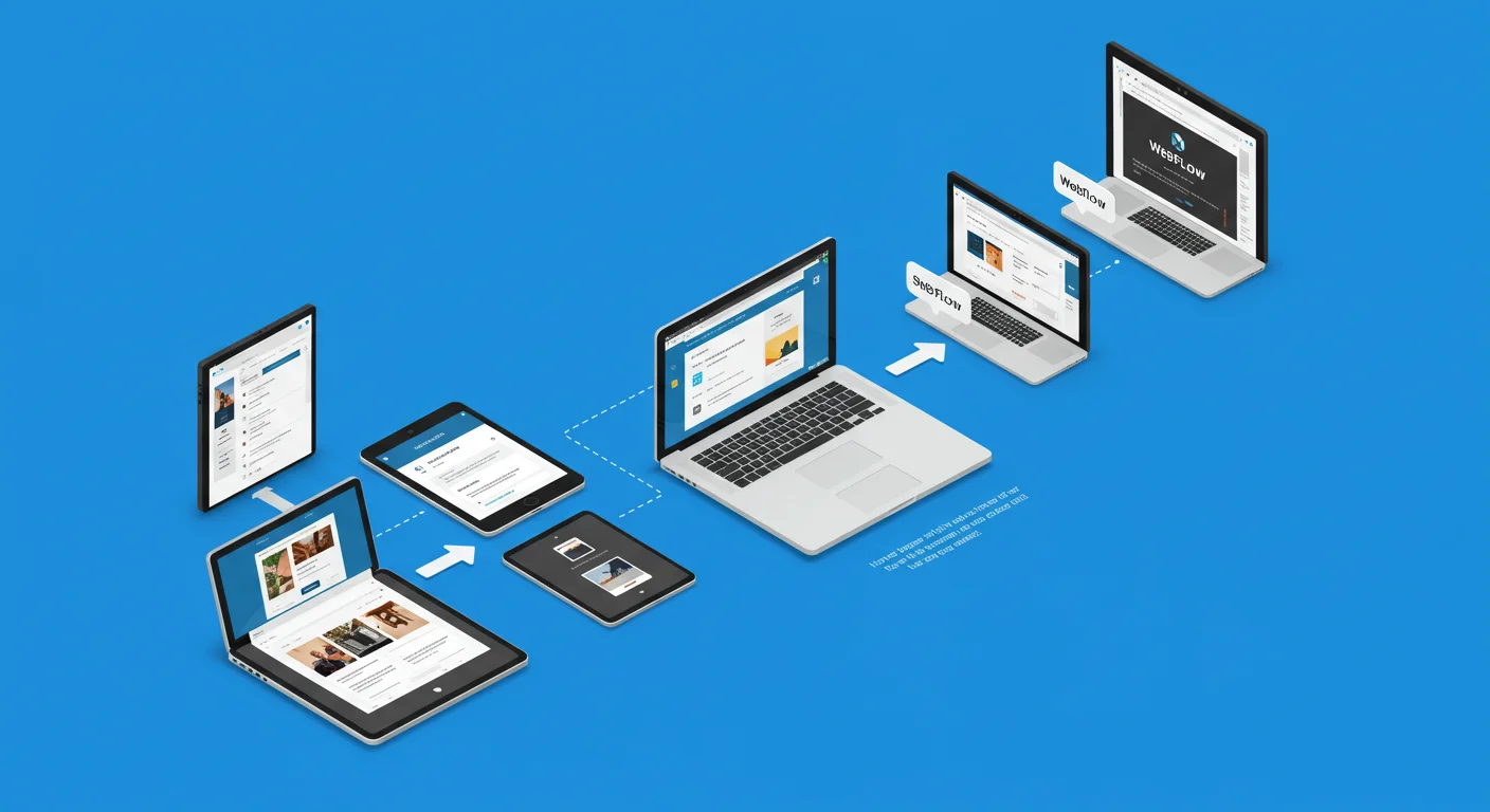
In the fast-paced world of digital product development, efficient and collaborative design processes are paramount. Gone are the days of siloed design tools and cumbersome file handoffs. Enter Figma, a revolutionary cloud-based design platform that has redefined the modern UI/UX workflow. Figma’s unique collaborative capabilities, intuitive interface, and robust feature set have made it an indispensable tool for individuals and teams looking to streamline their design process from ideation to implementation.
The Figma workflow is more than just a sequence of steps; it’s a dynamic, iterative, and highly collaborative ecosystem that fosters seamless communication between designers, developers, product managers, and stakeholders. It breaks down traditional barriers, allowing multiple team members to work on the same file simultaneously, provide real-time feedback, and ensure design consistency throughout the product lifecycle.
This comprehensive guide will delve deep into the Figma workflow, exploring its core principles, outlining a typical step-by-step process, highlighting the key features that empower this efficiency, and detailing best practices for optimizing your design operations. Whether you’re a seasoned designer, a budding UX enthusiast, or a stakeholder looking to understand the design process better, this guide will illuminate how Figma transforms the way digital products are conceived, designed, and brought to life.
What is Figma? A Brief Overview
Before diving into the workflow, let’s quickly define Figma:
Figma is a vector graphics editor and prototyping tool primarily used for designing user interfaces (UI) and user experiences (UX) for web, mobile, and other digital products. What truly sets it apart is its cloud-based nature, meaning:
- Browser-Based: It runs directly in your web browser, eliminating the need for software installation or constant updates.
- Real-time Collaboration: Multiple users can access and edit the same design file simultaneously, seeing each other’s cursors and changes in real-time. This is its most defining feature.
- Cross-Platform: Accessible on any operating system with a web browser (Windows, macOS, Linux, Chrome OS).
- All-in-One Solution: It combines design, prototyping, and developer handoff functionalities within a single platform.
Why Figma for Your Design Workflow? Key Advantages
Figma’s popularity stems from its ability to address common pain points in traditional design workflows:
- Seamless Collaboration: No more sending files back and forth. Everyone works on the single source of truth, reducing version control issues and fostering real-time teamwork.
- Accessibility & Convenience: Being browser-based means you can access your work from anywhere, on any device, without installation.
- Streamlined Feedback: Stakeholders can view designs, leave comments directly on the canvas, and participate in design reviews effortlessly.
- Design System Management: Figma excels at building and maintaining robust design systems with reusable components and styles, ensuring consistency and accelerating design.
- Efficient Handoff: Dev Mode provides developers with instant access to inspect designs, copy code snippets, and extract assets, minimizing friction in the implementation phase.
- Version Control: Automatic version history means you never lose work and can easily revert to previous states.
- Cost-Effective: Its free tier is generous, and paid plans offer excellent value for teams.
The Figma Workflow Explained: A Step-by-Step Journey
A typical Figma workflow mirrors the standard UI/UX design process, but with Figma’s collaborative advantages woven throughout each phase.
Phase 1: Discovery & Strategy (Pre-Figma / Research Integration)
While this phase often happens outside Figma, the insights gained directly inform your design work within the tool.
- Activities: User research (interviews, surveys), competitor analysis, defining project goals, user personas, user stories, feature prioritization, information architecture (sitemaps, user flows).
- Figma Integration:
- Brainstorming: Use Figma’s FigJam (a collaborative online whiteboard) for initial brainstorming sessions, affinity mapping, and user flow diagrams.
- Documentation: Import research findings, mood boards, and brand guidelines directly into Figma files for easy reference by the design team.
- User Flows/Sitemaps: Create basic user flow diagrams or sitemaps directly in Figma using simple shapes and connectors.
Phase 2: Ideation & Wireframing (Low-Fidelity Design)
This is where visual design begins, focusing on structure and functionality rather than aesthetics.
- Goal: Quickly sketch out layouts, content placement, and basic interactions.
- Activities: Sketching, creating low-fidelity wireframes (grayscale, minimal detail), exploring different layout options.
- Figma Application:
- Frames: Use Figma’s “Frames” (artboards) to represent different screens or pages.
- Basic Shapes: Drag and drop simple rectangles, lines, and text blocks to represent content areas, buttons, and images.
- Grayscale: Stick to a grayscale palette to avoid getting bogged down in color choices too early.
- Quick Iteration: Figma’s speed allows for rapid creation and duplication of wireframes, making it easy to explore many ideas quickly.
- Collaboration: Share wireframes with team members for early feedback, using comments to discuss layout decisions.
Phase 3: UI Design (High-Fidelity Design)
Bringing the visual identity to life, adding colors, typography, imagery, and detailed components.
- Goal: Create pixel-perfect designs that align with brand guidelines and provide an excellent user interface.
- Activities: Applying color palettes, selecting typography, designing icons and illustrations, creating detailed UI components (buttons, input fields, navigation bars), building out all screens.
- Figma Application:
- Styles: Define and apply Color Styles, Text Styles, and Effect Styles for consistency and easy global updates.
- Components & Variants: Create reusable UI elements as Components (e.g., a button) and define their different states or variations as Variants (e.g., primary, secondary, disabled, hover). This is crucial for scalability and efficiency.
- Auto Layout: Use Auto Layout to build responsive frames and components that automatically adjust their size and spacing based on content changes. This is a game-changer for responsive design.
- Plugins: Leverage Figma plugins for tasks like generating dummy data, optimizing images, or integrating with external services.
- Team Libraries: Publish components and styles to a Team Library, making them accessible across multiple files and projects for consistent design systems.
- Live Collaboration: Designers can work on different parts of the same screen or different screens simultaneously, with real-time visibility.
Phase 4: Prototyping & User Testing
Making designs interactive to simulate the user experience and gather feedback.
- Goal: Create clickable prototypes to test user flows, gather feedback, and validate design decisions.
- Activities: Linking screens, adding interactive elements, conducting usability testing, iterating based on feedback.
- Figma Application:
- Prototype Mode: Switch to Prototype Mode to define interactions between frames and components (e.g., “On Click,” “On Hover,” “After Delay”).
- Smart Animate: Use Smart Animate for smooth, sophisticated transitions between similar frames, automatically interpolating changes.
- Sharing Prototypes: Share a live prototype link with stakeholders and users for testing. They don’t need a Figma account to view or interact.
- Comments: Users can leave comments directly on the prototype, pinpointing specific areas for feedback.
- Observation: Observe user interactions with the prototype to identify pain points and areas for improvement.
Phase 5: Handoff & Development
Preparing design files for engineers to implement the user interface.
- Goal: Provide developers with all necessary design specifications, assets, and information for accurate implementation.
- Activities: Documenting design specifications, exporting assets, communicating design intent.
- Figma Application:
- Dev Mode: Figma’s dedicated Dev Mode provides developers with:
- Inspect Panel: Automatically generated CSS, iOS, and Android code snippets for selected elements.
- Measurements: Pixel-perfect measurements for spacing, sizing, and positioning.
- Assets: Easy export of images, icons, and other assets in various formats (SVG, PNG, JPG).
- Component Properties: Details on component variants and properties.
- Link to Codebase: Ability to link design components directly to code components.
- Comments: Use comments to clarify complex interactions, edge cases, or specific implementation notes.
- Version History: Developers can access previous versions of the design if needed.
- Team Libraries: Developers can reference the published design system components, ensuring they build consistent UI elements.
- Dev Mode: Figma’s dedicated Dev Mode provides developers with:
Phase 6: Iteration & Maintenance (Ongoing Refinement)
Design is never truly “done.” This phase involves continuous improvement based on user feedback, analytics, and evolving business needs.
- Goal: Continuously improve the product based on data and user feedback.
- Activities: A/B testing, analyzing user behavior, gathering new requirements, updating existing features, designing new features.
- Figma Application:
- Version History: Easily track changes and revert if necessary.
- Team Libraries: Update components in the library, and all instances across projects will show a notification to update, ensuring consistency.
- Comments: Continue using comments for ongoing feedback and discussions.
- Live Collaboration: Designers and product managers can quickly iterate on designs, test new ideas, and deploy updates.
Key Figma Features that Empower the Workflow
Figma’s robust feature set is what truly enables its efficient and collaborative workflow:
- Auto Layout: A powerful feature that allows frames and components to automatically resize and rearrange their children elements based on content changes. Essential for building responsive designs and maintaining consistent spacing.
- Components & Variants: The cornerstone of design systems in Figma. Components are reusable UI elements. Variants allow you to define different states or types of a component (e.g., button states like default, hover, disabled; or different sizes like small, medium, large). This ensures consistency and rapid iteration.
- Styles (Text, Color, Effect, Grid): Define global styles for colors, typography, shadows, and grid layouts. Applying styles ensures consistency across your designs and allows for quick, global updates (e.g., changing a brand color updates all instances).
- Plugins: Extend Figma’s functionality with a vast ecosystem of third-party plugins for tasks like generating dummy text/images, checking accessibility, optimizing SVGs, or integrating with external tools.
- Team Libraries: Publish components and styles from a “source of truth” file to a Team Library. This allows other designers to access and use these elements in their own files, ensuring design system adherence across an organization.
- Comments & Live Collaboration: The ability for multiple users to work in the same file simultaneously, see each other’s cursors, and leave contextual comments directly on design elements. This facilitates real-time feedback and reduces communication overhead.
- Version History: Figma automatically saves versions of your file, allowing you to browse past iterations, compare changes, and restore previous versions at any time. This eliminates the need for manual file saving and version naming.
- Dev Mode: A dedicated workspace within Figma designed specifically for developers. It provides instant access to design specifications (measurements, colors, fonts), automatically generated code snippets (CSS, iOS, Android), and easy asset export, significantly streamlining the handoff process.
- Prototyping: Create interactive prototypes by linking frames and adding various triggers and animations. This allows for realistic user flow simulations and effective usability testing.
- FigJam: A companion online whiteboard tool integrated with Figma, perfect for brainstorming, diagramming, workshops, and other collaborative ideation sessions.
Best Practices for an Optimized Figma Workflow
To truly maximize the benefits of Figma, adopt these best practices:
- Organize Your Files and Pages Meticulously:
- Use clear, consistent naming conventions for files, pages, frames, and layers (e.g.,
[Project Name] - UI Designs,01_Onboarding,02_Dashboard). - Group related elements using Frames or Groups.
- Utilize page sections (e.g., “Explorations,” “Final Designs,” “Components,” “Archive”) to keep your file tidy.
- Use clear, consistent naming conventions for files, pages, frames, and layers (e.g.,
- Leverage Components and Styles from Day One:
- Start building your design system early. Convert frequently used UI elements into Components.
- Define Color Styles, Text Styles, and Effect Styles immediately. This ensures consistency and makes global updates incredibly efficient.
- Master Auto Layout:
- Auto Layout is a superpower for responsive design. Use it for buttons, navigation items, cards, and any element that needs to adapt to content changes or different screen sizes.
- Communicate Effectively with Comments:
- Encourage all stakeholders to use Figma’s commenting feature for feedback. This keeps discussions contextual and centralized.
- Designers should also use comments to explain complex interactions or design decisions to developers.
- Maintain a Single Source of Truth:
- For shared components and styles, use a dedicated “Design System” file published as a Team Library. This ensures everyone is working from the latest, approved elements. Avoid duplicating components across multiple files.
- Regularly Clean Up Your Files:
- Delete unused layers, components, and pages.
- Consolidate duplicate styles. A clean file is easier to navigate and more performant.
- Utilize Plugins Strategically:
- Explore the Figma Community for plugins that automate repetitive tasks (e.g., content generation, accessibility checks, icon management). Don’t overdo it, but find ones that genuinely boost your efficiency.
- Embrace Iteration:
- Figma’s version history and collaborative nature make iteration easy. Don’t be afraid to experiment and get feedback early and often.
- Collaborate with Developers Early and Often:
- Involve developers during the design process, not just at handoff. Their early input can prevent costly reworks.
- Utilize Dev Mode to ensure a smooth transition from design to code.
Conclusion
The Figma workflow represents a paradigm shift in how digital products are designed and developed. By fostering real-time collaboration, providing powerful design system management tools, and streamlining the handoff process, Figma empowers teams to work more efficiently, communicate more effectively, and deliver higher-quality products faster.
Embracing a well-structured Figma workflow means moving beyond isolated design tasks to a truly integrated, iterative, and collaborative product development cycle. Whether you’re building a simple landing page or a complex enterprise application, mastering the Figma workflow is an essential step towards unlocking your full creative potential and achieving digital excellence. Dive in, explore its features, and transform your design process.