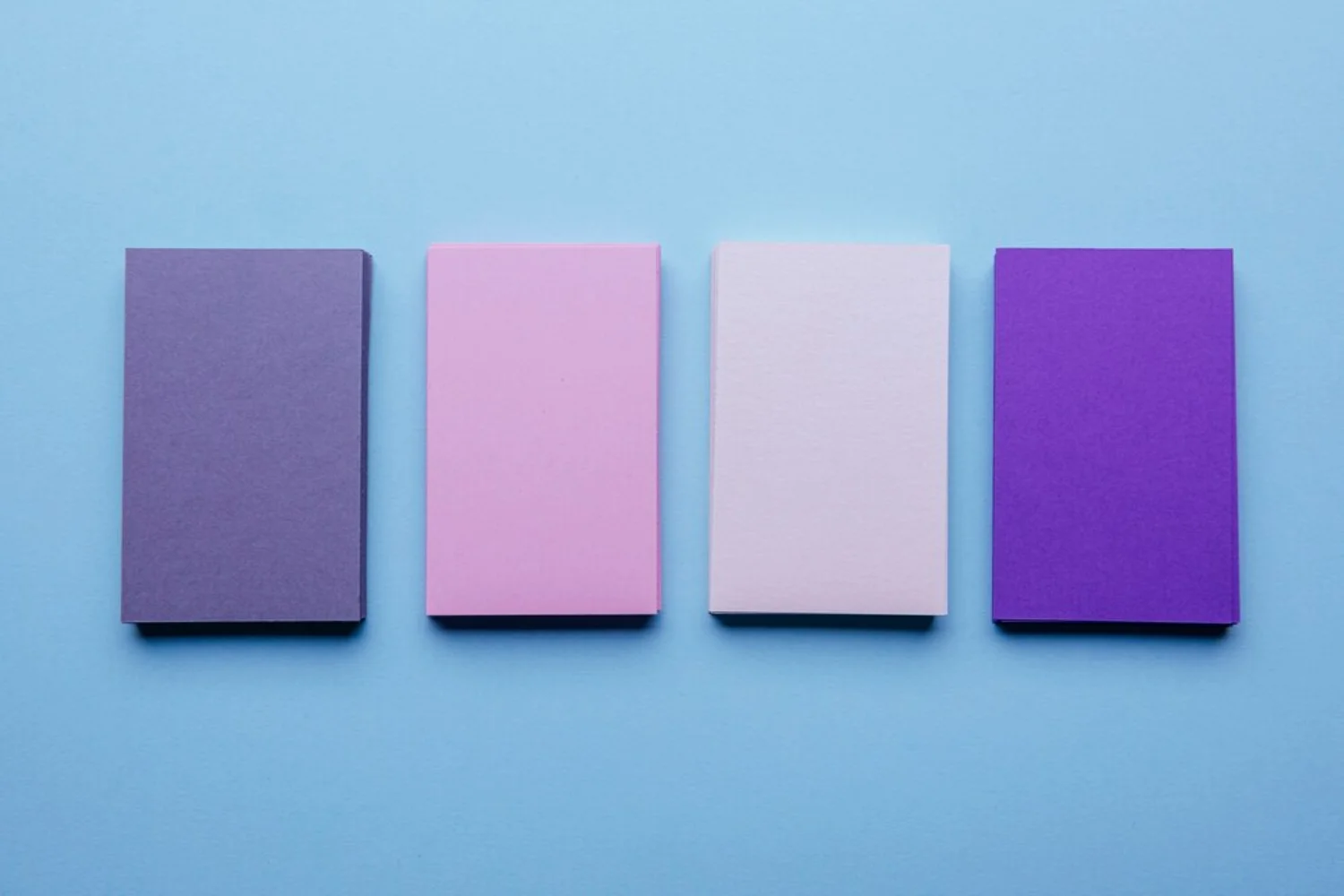
Purple is a color that effortlessly evokes creativity, luxury, and a touch of mystery, making it a perennial favorite among designers across various fields. Whether you’re crafting a captivating website, developing a distinctive brand identity, or simply decorating a living space, a thoughtfully chosen purple color palette can infuse your project with unparalleled depth and sophistication. This comprehensive guide will delve into the fascinating psychology behind purple, explore its most effective applications, and present a collection of stunning palettes to spark inspiration for your next design endeavor.
Why Purple is a Powerful Color in Design
Historically, purple has been deeply intertwined with concepts of royalty, opulence, and spirituality. Its unique position on the color spectrum, nestled between the calming tranquility of blue and the vibrant energy of red, grants it a fascinating dual nature. This blend allows purple to be both serene and bold, making it incredibly adaptable for diverse design needs.
- Evokes Emotion: Depending on its specific shade, purple can inspire a wide range of emotions. Lighter purples like lavender can induce a sense of calm, peace, and even nostalgia, making them ideal for wellness or romantic themes. Deeper, richer purples, on the other hand, can spark creativity, convey mystery, or signify power and ambition. This emotional versatility allows designers to fine-tune the message of their work.
- Represents Luxury: For centuries, purple dyes were extraordinarily rare and expensive, often reserved exclusively for emperors, kings, and religious leaders. This scarcity led to its strong association with wealth, nobility, and regal elegance. Even today, this historical context persists, making purple a powerful and sophisticated choice for brands and designs that aim to convey exclusivity, high quality, and prestige.
- Versatile: One of purple’s greatest strengths is its incredible adaptability. It seamlessly integrates into a vast array of design themes and styles. From the sleek, cutting-edge aesthetics of modern tech interfaces to the soft, romantic styles of wedding invitations, purple can be manipulated to fit almost any visual narrative. Its ability to pair well with both warm and cool colors further enhances its versatility.
- Gender Neutral: While traditionally sometimes stereotyped as feminine, purple’s broad appeal transcends gender. Many shades, particularly deeper purples or those leaning towards blue (like indigo), are widely accepted and appreciated by all genders. This makes it an excellent choice for designs targeting a wide and inclusive audience, avoiding gender-specific limitations.
- Cultural Significance: Across different cultures, purple holds diverse meanings, adding another layer of depth to its use. In some Asian traditions, it can symbolize spirituality, enlightenment, and even prosperity. In certain Western cultures, particularly historically, it might be associated with mourning or remembrance. Understanding these nuances is vital for global design projects, ensuring that your use of purple is not only effective but also culturally sensitive and respectful.
The Psychology of Purple Shades
The specific shade of purple you choose profoundly impacts the emotions and messages your design conveys. Selecting the right hue is crucial for aligning your visual communication with your project’s overarching goals.
- Lavender (#E6E6FA): This soft, delicate, and often pale shade is inherently calming, peaceful, and romantic. It’s an excellent choice for wellness brands, serene spa environments, delicate wedding invitations, and designs aiming for a gentle, feminine, or nostalgic touch. Its lightness evokes a sense of freshness and purity.
- Lilac (#C8A2C8): Slightly deeper than lavender but still light and airy, lilac is playful, youthful, and charming. It’s ideal for creative projects, lifestyle brands, children’s products, or designs that want to feel lighthearted, whimsical, and fresh. It often carries a spring-like, optimistic feel.
- Amethyst (#9966CC): Named after the precious gemstone, amethyst is a medium, often vibrant purple that evokes spirituality, mysticism, and wisdom. It’s perfect for holistic brands, meditation apps, spiritual retreats, or any design seeking a deeper, more ethereal, or introspective connection.
- Violet (#8A2BE2): Bold, vibrant, and energetic, violet is a strong, pure purple often associated with innovation and technology. It commands attention and suggests creativity, imagination, and a forward-thinking approach. It’s frequently seen in the tech and entertainment industries.
- Royal Purple (#7851A9): As its name suggests, royal purple is a deeply regal, rich, and luxurious shade. It’s the go-to color for high-end brands, premium products, luxury services, or designs where an undeniable air of exclusivity, grandeur, and prestige is desired.
- Plum (#673147): Rich, deep, and moody, plum is a sophisticated and mature purple with hints of brown or red. It’s ideal for dramatic, vintage-inspired designs, gourmet food branding, or projects that require a sense of grounded sophistication, warmth, and depth.
- Deep Purple (#4B0082): Mysterious, powerful, and often intense, deep purple (like indigo or dark violet) is frequently used in edgy, modern projects, or designs that aim to create a sense of intrigue, depth, and even a touch of the unknown. It can be very impactful and dramatic.
Inspiring Purple Color Palette Ideas for Design
Ready to incorporate purple into your next project? Here are some stunning purple color palette ideas, each designed to evoke a specific mood and perfectly suited for various applications:
Lavender Bliss
This palette is all about softness and serenity, creating a tranquil and inviting atmosphere. It’s light, airy, and evokes a sense of calm and gentle beauty.
- Lavender (#E6E6FA) – The primary calming tone.
- Pale Pink (#FADADD) – Adds warmth and a touch of romance.
- Soft Gray (#D3D3D3) – Provides a neutral, balancing element.
- White (#FFFFFF) – Ensures cleanliness and contrast.
- Perfect for: Feminine websites, delicate wedding invitations, wellness brands, serene interior spaces, baby product branding, or gentle beauty product packaging.
Royal Elegance
A truly luxurious and sophisticated combination that speaks of grandeur, high quality, and timeless class. This palette exudes opulence.
- Royal Purple (#7851A9) – The dominant regal hue.
- Gold (#FFD700) – Adds metallic richness and luxury.
- Deep Navy (#2C2C54) – Provides depth and a sophisticated anchor.
- Champagne (#F7E7CE) – A soft, warm neutral for balance and refinement.
- Perfect for: Luxury brands, high-end product packaging, exclusive event planning websites, formal invitations, premium service providers, or classic interior design.
Mystical Night
This palette creates an aura of intrigue, mystery, and modernity, ideal for designs that need to feel cutting-edge and enigmatic. It’s dark, dramatic, and captivating.
- Deep Purple (#4B0082) – The primary mysterious tone.
- Midnight Blue (#191970) – Enhances depth and nocturnal feel.
- Black (#000000) – Provides ultimate contrast and sophistication.
- Silver (#C0C0C0) – Adds a subtle, cool metallic gleam.
- Perfect for: Tech websites, nightlife branding, mystical-themed designs, sci-fi related content, gaming interfaces, or abstract art.
Violet Bloom
Vibrant and energetic, this palette is bursting with creativity and a modern, artistic flair. It’s lively, playful, and full of personality.
- Violet (#8A2BE2) – The bold, energetic core.
- Fuchsia (#FF00FF) – Adds an intense, playful pop.
- Coral (#FF7F50) – Introduces a warm, lively contrast.
- Light Peach (#FFDAB9) – Softens the palette and provides a gentle highlight.
- Perfect for: Creative brands, fashion websites, modern art portfolios, designs that need to pop with color, or youth-oriented products.
Rustic Plum
Warm, earthy, and inviting, this palette combines the richness of plum with natural tones for a grounded, cozy, and sophisticated feel.
- Plum (#673147) – The rich, deep, and warm primary.
- Olive Green (#556B2F) – Provides an earthy, natural complement.
- Beige (#F5F5DC) – A soft, neutral base for warmth and lightness.
- Warm Brown (#8B4513) – Adds organic depth and a grounding element.
- Perfect for: Rustic designs, vintage branding, earthy home decor websites, natural product lines, artisanal crafts, or cozy café branding.
Cosmic Dreams
Inspired by the cosmos, this palette is imaginative, futuristic, and full of wonder. It’s cool, expansive, and evokes a sense of the unknown.
- Amethyst (#9966CC) – The mystical, primary purple.
- Teal (#008080) – Adds a cool, watery, and expansive feel.
- Cyan (#00FFFF) – Provides a bright, energetic contrast.
- Black (#101010) – Creates depth and mimics the vastness of space.
- Perfect for: Sci-fi themes, futuristic designs, gaming websites, anything related to space and technology, or innovative software interfaces.
Best Uses of Purple in Design
Purple’s versatility makes it suitable for a wide array of design applications. Here’s how you can effectively leverage a purple color palette in different contexts:
Branding
Purple is a fantastic choice for logos and brand identities, as it instantly conveys attributes like creativity, luxury, and ambition. Major brands such as Cadbury (known for its iconic purple packaging), Yahoo (historically using purple in its logo), and Twitch (with its distinctive purple branding for streaming) have successfully utilized purple to differentiate themselves and evoke a sense of trust and sophistication among their audiences. When designing a logo, consider how different shades of purple can communicate your brand’s core values, whether it’s the playful lilac of a children’s brand or the deep royal purple of a high-end service.
Web Design & Digital Interfaces
For websites and digital interfaces aiming to appear bold, innovative, and visually engaging, purple is an excellent primary or accent color. Using gradients that smoothly transition between various purple tones can create modern and dynamic effects, adding depth and visual interest to your site. You can find numerous examples on platforms like Dribbble, showcasing how purple is masterfully integrated into contemporary web layouts.
Here are 30 examples of how purple is effectively used in various websites and digital platforms:
- Twitch: Uses a vibrant purple as its primary brand color, signifying creativity, community, and entertainment in the gaming and streaming world.
- Discord: Features a soft, inviting purple in its branding, emphasizing community, communication, and a friendly user experience.
- Yahoo!: Historically known for its purple branding, conveying a sense of fun, innovation, and approachability in the early internet era.
- Cadbury: Its iconic royal purple packaging instantly communicates luxury, quality, and indulgence for its chocolate products.
- Figma: While primarily blue, Figma often incorporates purple accents and gradients in its UI and marketing, hinting at creativity and collaboration.
- Asana: Uses a calming yet vibrant purple in its branding and UI elements, promoting focus, organization, and productivity.
- Notion: Features subtle purple hues in its minimalist design, suggesting creativity, flexibility, and personalized organization.
- Behance: A platform for creative professionals, often uses purple in its design elements to evoke artistic expression and innovation.
- Dribbble: A design community that frequently showcases projects with diverse purple palettes, demonstrating its versatility in modern UI/UX.
- Spotify (some campaigns): Occasionally uses vibrant purple in its marketing and playlist covers to convey energy, creativity, and a modern music experience.
- Tatcha: A luxury skincare brand that uses deep, rich purples in its packaging and website to convey elegance, tradition, and premium quality.
- Lush Cosmetics: Often incorporates bright, playful purples in its product branding and website, reflecting its natural, vibrant, and ethical ethos.
- Sephora (seasonal campaigns): While its core is black and white, Sephora frequently uses bold purples in seasonal campaigns and product launches to signify excitement and beauty innovation.
- Headspace: A meditation app that uses soft, calming purples in its illustrations and UI, promoting tranquility and mental well-being.
- Calm: Another popular meditation app that uses serene purples and blues to create a relaxing and peaceful user environment.
- MasterClass: Often uses deep, sophisticated purples in its branding and course visuals to signify premium education and expert knowledge.
- Skillshare: A learning platform that uses a friendly, creative purple in its branding to encourage artistic and practical skill development.
- Canva: While multi-colored, Canva’s design tools often feature purple as a prominent accent, emphasizing creativity and ease of design.
- Mailchimp: Uses a playful, yet professional purple in its branding, conveying a creative and user-friendly approach to email marketing.
- Adobe Creative Cloud: Many Adobe products (like Illustrator) feature purple in their icons and branding, symbolizing creativity and digital artistry.
- Purple (Mattress Company): Their entire brand identity revolves around a distinctive purple, emphasizing comfort, innovation, and a unique product.
- Lyft: Uses a bright, recognizable purple in its branding, conveying a modern, accessible, and friendly ride-sharing service.
- DoorDash (some elements): While primarily red, DoorDash occasionally uses purple accents in its app and marketing to signify a vibrant, diverse delivery experience.
- A creative agency portfolio: Many design agencies use a bold purple as an accent or primary color on their websites to showcase their innovative and artistic capabilities.
- A futuristic tech startup: Often employs deep purples and blues with neon accents to convey cutting-edge technology and forward-thinking solutions.
- An online yoga studio: Uses soft lavenders and lilacs to create a calming, inviting, and spiritual atmosphere on their platform.
- A luxury real estate firm: Might use royal purple alongside gold or silver on their website to project exclusivity and high-end properties.
- A bespoke fashion designer’s site: Could use plum or deep purple to convey sophistication, unique style, and artistic flair.
- A gaming news portal: Often features vibrant violets and deep purples to reflect the energetic and immersive nature of the gaming world.
- An aromatherapy product website: Uses light, soothing purples like lavender to suggest relaxation, natural ingredients, and well-being.
These examples demonstrate that purple is not just a color but a strategic choice that can profoundly influence perception and user engagement across various digital experiences.
Fashion and Beauty
The beauty industry frequently embraces purple for its inherently feminine and luxurious appeal. Lighter shades like lavender and lilac are particularly popular in packaging and branding for cosmetics, skincare, and fragrances, conveying elegance, a gentle touch, and often a sense of natural purity. Deeper purples can signify high-end, sophisticated fashion lines, evening wear, or exclusive accessory collections, adding a touch of drama and allure.
Interior Design
In home decor, purple can dramatically transform a space, creating moods ranging from tranquil to opulent. Deep purples, such as plum or royal purple, can add richness, warmth, and a touch of drama to a room, making it feel opulent, intimate, and inviting. These shades work well in formal living areas or luxurious bedrooms. Conversely, lighter shades like lavender or lilac can create a serene, calming, and airy atmosphere, perfect for bedrooms, meditation spaces, or nurseries, promoting relaxation and peace.
Event Design
From elegant weddings and sophisticated galas to vibrant corporate events and themed parties, purple is a consistently popular choice for event themes. It pairs beautifully with metallic accents like gold or silver for a lavish and celebratory feel, or with soft pinks and creams for a more romantic, whimsical, and dreamy ambiance. Purple lighting can also be strategically used to set a sophisticated, mysterious, or festive mood, enhancing the overall atmosphere of any event.
How to Create Your Own Purple Color Palette
Crafting a harmonious purple color palette doesn’t have to be daunting. Follow these steps to build a palette that perfectly suits your design vision:
- Start with a Base Shade: Begin by selecting a primary purple shade that resonates most strongly with the mood or theme of your project. This chosen hue will serve as the anchor of your entire palette. Consider the emotional impact you want to achieve – do you need calming lavender, regal royal purple, or energetic violet?
- Add Complementary Colors: To create visual contrast, excitement, and make your design pop, pair your chosen purple with its complementary color. On the color wheel, yellow is directly opposite purple, making gold or various shades of yellow excellent choices for vibrant contrast. For a more harmonious and cohesive look, consider analogous colors such as blue and pink, which sit next to purple on the color wheel. These combinations create a sense of unity and flow.
- Use Neutrals for Balance: Incorporate neutral colors like white, various shades of gray, black, or beige to balance the more assertive purple tones. Neutrals are crucial because they provide visual breathing room, prevent the design from becoming overwhelming, and allow the purple to stand out without dominating. They also help ground the palette and make it more adaptable.
- Define Accent Colors: Beyond your primary and neutral tones, consider adding one or two accent colors. These could be brighter, bolder hues from your complementary or analogous choices, or even a completely different color that provides a surprising pop. Accent colors are used sparingly to draw attention to specific elements or add dynamism.
- Test in Context: Before finalizing your palette, it is absolutely crucial to test it in real-world scenarios. Apply your chosen colors to mockups, prototypes, or small design elements. Observe how the colors interact across different devices (desktop, mobile), formats (print, digital), and even lighting conditions. This step is vital for ensuring your palette looks good and functions effectively in its intended application.
Popular Tools for Building Purple Color Palettes
Several online tools can assist you in generating and exploring stunning color combinations, including those centered around purple. These tools make the process of color selection more efficient and inspiring:
- Coolors: An incredibly fast and user-friendly tool for generating harmonious color palettes with a single press of the spacebar. You can lock in colors you like and generate new combinations around them, making it perfect for rapid prototyping.
- Adobe Color: Offers a robust platform to explore trending palettes, create custom ones using various color rules (monochromatic, analogous, complementary, triadic, etc.), and even extract color palettes directly from images. It’s a powerful tool for both beginners and experienced designers.
- Canva: Provides a vast library of pre-made color palettes, making it easy to find quick inspiration and apply them to your designs. Its user-friendly interface allows for easy experimentation and integration into your projects.
- Colormind: An AI-powered tool that generates unique color combinations from scratch or based on an image. It often surprises you with unexpected yet appealing results, pushing you beyond conventional choices.
- Dribbble: While not a palette generator, Dribbble is a community platform where designers showcase their work. It’s an excellent visual resource for finding real-world design examples that effectively use purple palettes, offering practical inspiration and showing how colors are applied in actual projects.
- Paletton: A classic tool for creating color schemes, allowing you to pick a base color and then generate monochromatic, analogous, complementary, or triadic palettes around it.
- Color Hunt: Offers a curated collection of beautiful, hand-picked color palettes, often featuring trendy and aesthetically pleasing combinations that include various shades of purple.
Frequently Asked Questions About Purple Color Palettes
What does the color purple symbolize?
Purple primarily symbolizes creativity, luxury, spirituality, and mystery. It is also often associated with wisdom, ambition, magic, and royalty due to its historical rarity and cost.
What colors pair well with purple?
Purple pairs beautifully with a variety of colors. For contrast, consider gold, yellow, or bright orange. For harmony, blues and pinks work wonderfully. Neutrals like gray, white, black, and beige also pair well, allowing purple to stand out. The best pairing largely depends on the specific mood or aesthetic you aim to create in your design.
Is purple a good color for branding?
Absolutely! Purple is an excellent choice for brands that wish to convey creativity, sophistication, innovation, a sense of luxury, or a unique and memorable identity. Its distinctiveness can help a brand stand out.
What industries commonly use purple in design?
Purple is particularly popular in the tech (e.g., Twitch, Discord), beauty (e.g., Tatcha, Lush), wellness (e.g., Headspace), luxury, and creative industries (e.g., Figma, Behance), where its symbolic meanings align well with brand messaging and target audiences.
How can I avoid overusing purple in my design?
To prevent purple from overwhelming your design, balance it with ample neutral colors like white, various grays, or beige. You can also use purple as an accent color rather than the dominant tone for a more subtle yet impactful effect, allowing it to draw attention to key elements without saturating the visual space.
What tools can I use to create a purple color palette?
Tools like Coolors, Adobe Color, Canva, Colormind, Paletton, and Color Hunt are all excellent resources for generating and exploring harmonious purple color palettes, helping you find the perfect combination for your project.
Can purple be used in minimalist designs?
Yes, absolutely! In minimalist designs, purple can be used sparingly as a powerful accent color to draw attention to key elements, or a very muted, desaturated purple can serve as a sophisticated background. The key is restraint and careful selection of the shade to maintain simplicity.
How does purple affect user experience on a website?
Purple can significantly affect user experience by evoking specific emotions. Lighter purples can create a calming and trustworthy environment, while deeper purples can convey sophistication and innovation. Its effective use can enhance brand perception and user engagement by creating a memorable visual identity.
Conclusion
A purple color palette is an exceptionally powerful tool for crafting designs that are not only bold and creative but also deeply memorable. Whether your goal is to build a distinctive brand, design an engaging website, or simply decorate a personal space, purple offers boundless possibilities for artistic expression and innovation. By carefully selecting the right shades, thoughtfully integrating complementary colors, and understanding its psychological and cultural nuances, you can curate a palette that perfectly aligns with your project’s objectives and evokes precisely the emotions you desire. The widespread use of purple across diverse and successful brands and digital platforms is a testament to its enduring appeal and effectiveness.
Ready to infuse your designs with the magic of purple? Explore our other design guides for more inspiration, or contact us for a personalized design consultation to bring your vision to life!

