

The layout of a website is the fundamental framework that organizes its content, guides user interaction, and ultimately shapes the overall user experience. It’s the invisible architecture that dictates where elements like navigation, text, images, and calls-to-action are placed, influencing everything from readability and aesthetic appeal to conversion rates and brand perception. A well-chosen and expertly executed website layout can transform a collection of pages into an intuitive, engaging, and highly effective digital environment.
This comprehensive guide will delve into a variety of popular and modern website layout ideas, providing a conceptual understanding of each structure, its common applications, and its inherent strengths. We’ll explore fundamental design principles that underpin effective layouts, dissect the key components that make up a typical web page, and offer best practices for selecting and implementing the perfect layout for your specific goals. Whether you’re designing a simple blog, a complex e-commerce store, or a dynamic portfolio, understanding these layout concepts is crucial to structuring a digital space that truly resonates with your audience.
What is a Website Layout?
A website layout refers to the arrangement of all the visual elements on a web page. It’s the blueprint that determines the position, size, and relationship between different content blocks, such as headers, footers, navigation menus, content areas, sidebars, and interactive elements. The goal of a good layout is to:
- Guide the User’s Eye: Direct visitors’ attention to the most important information.
- Improve Readability: Make content easy to consume and understand.
- Enhance Usability: Ensure navigation is intuitive and interactions are seamless.
- Reinforce Branding: Visually communicate the website’s purpose and brand identity.
- Optimize for Responsiveness: Adapt gracefully to different screen sizes (desktop, tablet, mobile).
Core Principles of Good Layout Design
Regardless of the specific layout chosen, certain universal principles contribute to effective web design:
- Visual Hierarchy: Arranging elements to show their order of importance. Larger, bolder, or more centrally placed elements typically draw the eye first.
- Balance: Distributing visual weight evenly across the page, whether symmetrically (mirroring elements) or asymmetrically (using contrasting elements to create equilibrium).
- Proximity: Grouping related items together to create logical sections and reduce clutter.
- Repetition: Using consistent design elements (fonts, colors, spacing) throughout the site to create a cohesive and predictable experience.
- Alignment: Arranging elements along invisible lines to create order and a sense of professionalism.
- Contrast: Using differences in color, size, shape, or typography to make elements stand out.
- White Space (Negative Space): The empty areas around and between elements. It improves readability, reduces clutter, and draws attention to content.
- Responsiveness: Designing layouts that automatically adjust and optimize for various screen sizes and devices.
Common Website Layout Ideas
Here are various conceptual website layout ideas, ranging from classic to modern, each suited for different types of content and user goals:
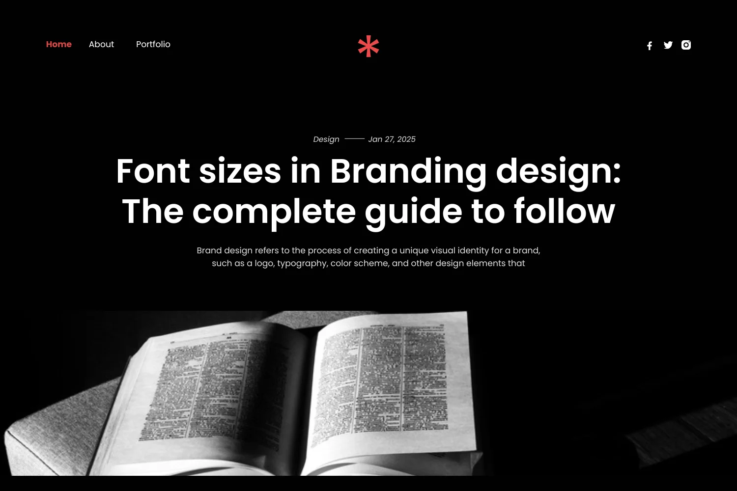
1. Single Column (Stacked) Layout
- Concept: The simplest and most common layout, especially for mobile devices. All content is arranged vertically, one block below the other.
- Best For: Blogs, articles, simple landing pages, mobile-first design.
- Strengths: Highly readable, excellent for storytelling, naturally responsive, easy to implement.
- Inspiration: Most blog post pages or long-form articles. See Medium for a prime example.
2. F-Pattern Layout
- Concept: Mimics natural reading behavior (left-to-right, top-to-bottom). Users scan horizontally across the top, then down the left side, then another horizontal scan. Forms an “F” shape.
- Best For: Content-heavy sites, blogs, search results, pages where quick scanning is common.
- Strengths: Aligns with user habits, effective for placing important information in key scanning areas.
- Inspiration: Many news websites or search engine results pages. See Google Search Results for a conceptual idea.
3. Z-Pattern Layout
- Concept: Similar to F-pattern but for less text-heavy pages. Users scan across the top, then diagonally down to the opposite side, then horizontally across the bottom. Forms a “Z” shape.
- Best For: Landing pages, simple product pages, sites with strong visual hierarchy and clear CTAs.
- Strengths: Guides the eye effectively through key elements (logo, hero, CTA), good for conversion.
- Inspiration: Many modern landing pages. See Mailchimp’s homepage for a general sense of guiding the eye.
4. Grid Layout (Column-Based)
- Concept: Content is organized into a series of rows and columns, creating a structured, modular appearance. Elements align neatly, providing order.
- Best For: Portfolios, e-commerce product listings, image galleries, dashboards.
- Strengths: Clean, organized, responsive (columns can stack), allows for easy comparison of items.
- Inspiration: Unsplash for image grids or Etsy for product grids.
5. Magazine / News Layout
- Concept: A complex grid layout designed to display a large amount of diverse content (articles, images, videos) on a single page, often with varying article sizes and prominent headlines.
- Best For: News websites, online magazines, content hubs.
- Strengths: Maximizes content visibility, encourages exploration, can be highly engaging.
- Inspiration: The New York Times or The Guardian.
6. Split Screen Layout
- Concept: The screen is divided vertically or horizontally into two distinct sections, often with contrasting content, colors, or images. Each section can serve a different purpose or target a different audience segment.
- Best For: Websites with two equally important paths, showcasing two distinct products/services, or creating visual contrast.
- Strengths: Visually striking, clear separation of content, effective for A/B choices.
- Inspiration: Many modern portfolio sites or product comparison pages. See examples on Awwwards.
7. Asymmetrical Layout
- Concept: Elements are intentionally unbalanced to create visual tension, dynamism, and a modern, artistic feel. Relies on careful use of white space and contrasting elements to maintain balance.
- Best For: Creative portfolios, artistic brands, unique product showcases.
- Strengths: Eye-catching, memorable, conveys creativity and boldness.
- Inspiration: Design agency portfolios or experimental websites. See examples on Dribbble.
8. Card-Based Layout
- Concept: Content is organized into individual “cards” – self-contained modules that typically include an image, title, and brief description. Cards are flexible and can be arranged in various grid patterns.
- Best For: Blogs, news feeds, e-commerce listings, social media feeds, dashboards.
- Strengths: Highly responsive, modular, easy to scan, visually appealing, encourages clicking for more details.
- Inspiration: Pinterest or Netflix‘s browsing interface.
9. Full-Screen Hero Layout
- Concept: The top section of the homepage features a large, impactful image or video that fills the entire screen, often with a bold headline and a prominent Call-to-Action (CTA) overlaid.
- Best For: Brand websites, product launches, portfolios, events.
- Strengths: Creates an immediate emotional connection, visually stunning, highly engaging.
- Inspiration: Many modern brand homepages. See Apple’s homepage or Nike’s homepage.
10. Fixed Sidebar / Navigation Layout
- Concept: A portion of the screen (usually a sidebar on the left or right) remains fixed as the user scrolls, providing persistent access to navigation, filters, or important information.
- Best For: Web applications, dashboards, extensive documentation, e-commerce sites with many filters.
- Strengths: Improves navigation, keeps key tools accessible, efficient for complex interfaces.
- Inspiration: Many web applications or documentation sites. See Google Docs (sidebar for outline) or Amazon’s product category filters.
11. Masonry Layout
- Concept: A grid layout where elements (often images or cards) are arranged without fixed row heights, fitting together like bricks in a wall. This optimizes space and creates a visually interesting, organic flow.
- Best For: Image galleries, portfolios with varying image aspect ratios, content feeds.
- Strengths: Visually dynamic, efficient use of space, responsive, ideal for showcasing diverse visual content.
- Inspiration: Pinterest is the most famous example.
12. Broken Grid / Overlapping Elements Layout
- Concept: Intentionally deviates from strict grid alignment, with elements overlapping, extending beyond their perceived boundaries, or appearing slightly askew. This creates a modern, edgy, and artistic feel.
- Best For: Creative agencies, artistic portfolios, fashion brands, websites aiming for a unique, rebellious aesthetic.
- Strengths: Highly distinctive, memorable, conveys creativity and innovation.
- Inspiration: Experimental web designs on Awwwards.
13. Single Page Layout
- Concept: All content is presented on a single, long-scrolling page, typically divided into distinct sections. Navigation often uses anchor links to jump between sections.
- Best For: Landing pages, portfolios, small business websites, event pages, product showcases.
- Strengths: Concise, linear storytelling, easy to navigate on mobile, good for focused messaging.
- Inspiration: Many modern landing pages or personal portfolios. See Apple’s product pages for a long-scrolling, sectioned approach.
14. Minimalist Layout
- Concept: Focuses on simplicity, clarity, and functionality by stripping away non-essential elements. Relies heavily on ample white space, strong typography, and high-quality visuals.
- Best For: Luxury brands, portfolios, art galleries, any site aiming for a sophisticated, uncluttered aesthetic.
- Strengths: Elegant, easy to digest, highlights content, fast loading, timeless.
- Inspiration: Apple (again) or high-end fashion brand websites.
15. Hero with Call-to-Action (CTA) Focus
- Concept: The hero section is designed to prominently feature a single, clear, and compelling Call-to-Action (CTA) button, often with minimal supporting text to avoid distraction.
- Best For: Lead generation landing pages, product sales pages, event registrations.
- Strengths: Maximizes conversion rates by guiding users directly to the desired action.
- Inspiration: Many marketing landing pages. See HubSpot’s landing page examples.
16. Horizontal Scrolling Layout (Use with Caution)
- Concept: Content moves horizontally as the user scrolls, rather than vertically. Often used for specific sections or entire pages to create a unique, immersive experience.
- Best For: Creative portfolios, interactive storytelling, art galleries (when executed very well).
- Strengths: Highly unique, memorable, can be very engaging.
- Caution: Can be confusing for users if not clearly indicated or intuitive. Needs strong visual cues.
- Inspiration: Some experimental portfolios on Awwwards.
17. Brutalist Layout
- Concept: A design trend that embraces raw, unpolished, and often unconventional aesthetics, characterized by large, unstyled typography, bold colors, exposed elements, and a disregard for traditional beauty standards.
- Best For: Artistic projects, experimental brands, websites aiming for a rebellious or anti-establishment feel.
- Strengths: Highly distinctive, memorable, challenges conventions.
- Inspiration: Brutalist Websites is a curated gallery of examples.
18. Split Grid Layout
- Concept: Combines elements of a grid layout with a split-screen approach. Different sections of the page are divided into a grid, but the grid itself might be split into two or more primary, distinct areas.
- Best For: Portfolios showcasing diverse project types, e-commerce sites with multiple product categories, or agencies with distinct service offerings.
- Strengths: Provides structure while allowing for visual separation and emphasis on different content blocks.
- Inspiration: Design agency homepages that categorize work.
19. Large Typography Dominant Layout
- Concept: Uses oversized, bold typography as a primary design element, often serving as headlines, navigation, or even decorative elements. Imagery might be secondary or minimal.
- Best For: Editorial websites, personal portfolios, art and design blogs, brands with a strong textual message.
- Strengths: Creates strong visual impact, emphasizes messaging, can be very modern and artistic.
- Inspiration: Many modern editorial or design blogs. See The Verge for a sense of bold headlines.
20. Fixed Background / Scrollable Content Layout
- Concept: The background image or video remains static while the content scrolls over it. This creates a sense of depth and a unique visual experience.
- Best For: Storytelling websites, product showcases, event pages, personal portfolios.
- Strengths: Visually immersive, creates a strong atmosphere, highlights background imagery.
- Inspiration: Parallax scrolling examples. See Wix’s parallax templates.
21. Off-Canvas Navigation Layout
- Concept: The main navigation menu is hidden off-screen (e.g., behind a hamburger icon) and slides into view when activated. This saves space, especially on smaller screens.
- Best For: Mobile-first designs, web applications, content-heavy sites where main navigation isn’t always needed.
- Strengths: Clean, uncluttered header, efficient use of screen real estate.
- Inspiration: Many mobile app interfaces or modern responsive websites.
22. Full-Screen Image Gallery Layout
- Concept: The entire page is dedicated to showcasing a series of large, high-resolution images, often with minimal text overlays or navigation.
- Best For: Photography portfolios, art galleries, visual product showcases.
- Strengths: Highly immersive, visually stunning, allows images to speak for themselves.
- Inspiration: Photography portfolio sites like 500px or Flickr.
23. Dashboard / Web Application Layout
- Concept: Designed for interactive web applications, typically featuring a fixed sidebar for primary navigation and a main content area for data, charts, and interactive elements.
- Best For: SaaS products, analytics tools, internal company dashboards, online management systems.
- Strengths: Highly functional, efficient for data display and complex interactions, clear navigation.
- Inspiration: Google Analytics or Slack’s desktop app.
24. Circular / Organic Layout Elements
- Concept: Incorporates non-linear, flowing, or circular shapes into the layout design, breaking away from traditional rectangular grids.
- Best For: Artistic brands, children’s websites, creative portfolios, sites aiming for a soft, friendly, or whimsical feel.
- Strengths: Unique, visually appealing, conveys creativity and softness.
- Inspiration: Modern graphic design trends. See Dribbble.
25. Typographic Hierarchy Layout
- Concept: The primary method of guiding the user’s eye and organizing content is through varying font sizes, weights, styles, and spacing. Imagery might be secondary or absent.
- Best For: Editorial content, literary sites, minimalist blogs, brand manifestos.
- Strengths: Emphasizes content, elegant, classic, highly readable when done well.
- Inspiration: Classic book layouts or minimalist editorial designs.
26. Fixed Header & Footer Layout
- Concept: Both the header and footer remain static at the top and bottom of the screen, respectively, while the main content area scrolls in between.
- Best For: E-commerce sites (persistent cart/checkout), web applications (persistent navigation/tools), sites needing constant branding.
- Strengths: Constant access to key navigation and information, consistent branding.
- Inspiration: Many e-commerce websites like Amazon.
27. Split Content with Overlapping Elements
- Concept: Similar to a split screen but with elements that intentionally break the dividing line, creating a dynamic and modern feel. Text might overlap images, or sections might bleed into each other.
- Best For: Creative portfolios, product showcases, landing pages aiming for a bold, artistic statement.
- Strengths: Visually engaging, creates depth, highly memorable.
- Inspiration: Experimental design agency websites.
28. Full-Width Sections Layout
- Concept: The page is composed of distinct sections that stretch across the entire width of the browser window, often with different background colors, images, or patterns.
- Best For: Landing pages, long-form sales pages, corporate websites, storytelling sites.
- Strengths: Creates clear content blocks, visually impactful, responsive.
- Inspiration: Many modern marketing websites.
29. Interstitial / Loading Screen Layout
- Concept: A temporary screen that appears before the main content loads, often used for branding, age verification, or a brief interactive experience.
- Best For: Luxury brands, gaming sites, age-restricted content, highly visual sites with heavy assets.
- Strengths: Builds anticipation, allows for creative branding, hides loading times.
- Inspiration: Many gaming websites or high-end fashion sites.
30. Persona-Based Layout (Conceptual)
- Concept: The layout dynamically adjusts or offers different entry points based on identified user personas. For example, a “New Here?” path vs. a “Returning Member” path, leading to different content arrangements.
- Best For: Websites with diverse user groups, educational platforms, community sites.
- Strengths: Highly personalized user experience, increased relevance for different audiences.
- Inspiration: Websites with user role-based dashboards or personalized content recommendations (e.g., Netflix once logged in).
Elements Within a Layout
While layouts define the overall structure, they are composed of common web elements:
- Header: Top section, usually contains logo, primary navigation, and sometimes CTAs.
- Navigation (Menu): Links to main sections of the website. Can be horizontal, vertical, off-canvas, etc.
- Hero Section: The prominent, often full-width area at the top of the homepage, typically with a headline, image/video, and primary CTA.
- Content Area: The main section where the website’s primary information (text, images, forms) resides.
- Sidebar: A vertical column alongside the main content, often used for secondary navigation, ads, related content, or filters.
- Footer: Bottom section, usually contains copyright info, secondary navigation links, social media icons, and contact details.
- Call-to-Action (CTA): Buttons or links designed to prompt a specific user action.
Best Practices for Choosing & Implementing a Layout
- Understand Your Audience: Who are your users? What are their needs and expectations?
- Define Your Goal: What do you want users to do on your site? (e.g., read, buy, contact, learn). The layout should facilitate this.
- Prioritize Content: What information is most important? Ensure it’s prominent and easily accessible.
- Start Mobile-First: Design for the smallest screen first, then scale up. This ensures a good experience for the majority of users.
- Keep it Simple: Avoid over-complicating the layout. Clarity and usability trump complexity.
- Test and Iterate: Build prototypes and test with real users. Gather feedback and refine your layout based on their behavior and preferences.
- Maintain Consistency: Once a layout pattern is established, stick to it across similar pages for predictability.
- Optimize for Performance: Ensure your chosen layout doesn’t hinder loading times, especially with heavy visuals.
- Consider Your Brand: The layout should align with your brand’s personality and aesthetic.
Conclusion
The selection and implementation of a website layout are foundational to its success. By moving beyond mere aesthetics and understanding the strategic implications of each structural choice, designers and developers can craft digital experiences that are not only visually appealing but also highly functional, intuitive, and effective in achieving their goals. From the simplicity of a single column to the dynamism of a broken grid, each layout idea offers a unique way to organize content and guide user interaction. By applying core design principles and adhering to best practices, you can ensure your website’s architecture truly supports its purpose, making it a welcoming and productive space for every visitor.
Frequently Asked Questions (FAQs)
Q1: What is the most common website layout?
The single-column (stacked) layout is the most common, especially given the prevalence of mobile browsing. Content is arranged vertically, one block after another, making it highly readable and naturally responsive.
Q2: How do I choose the best layout for my website?
Choosing the best layout depends on your website’s purpose, target audience, and content type.
- Purpose: Are you selling, informing, showcasing, or providing a service?
- Audience: Are they scanning quickly or reading in-depth?
- Content: Is it image-heavy, text-heavy, or interactive? Consider these factors, then prototype and test different options with real users.
Q3: What is the difference between an F-pattern and a Z-pattern layout?
Both are based on user scanning habits:
- F-Pattern: For content-heavy pages, users scan horizontally across the top, then vertically down the left side, then another horizontal scan. It creates an “F” shape.
- Z-Pattern: For less text-heavy pages, users scan across the top, diagonally down to the opposite side, then horizontally across the bottom. It creates a “Z” shape, guiding the eye through key points.
Q4: Are “sticky headers” a good layout idea?
Yes, sticky headers (or fixed headers) are generally a good layout idea. They remain visible at the top of the screen as the user scrolls, providing constant access to the main navigation and important calls-to-action. This improves usability and keeps branding consistently in view.
Q5: What is “white space” and why is it important in layout design?
White space (or negative space) refers to the empty areas around and between elements on a web page. It’s crucial because it:
- Improves Readability: Makes text easier to consume.
- Reduces Clutter: Prevents the page from looking busy and overwhelming.
- Highlights Content: Draws attention to key elements by providing visual breathing room.
- Creates Sophistication: Contributes to a clean, modern, and elegant aesthetic.
Q6: How does responsiveness affect website layouts?
Responsiveness is paramount. A good layout must adapt seamlessly to various screen sizes (desktops, laptops, tablets, smartphones). This means elements might rearrange, stack, resize, or disappear on smaller screens to ensure optimal viewing and interaction without horizontal scrolling. Mobile-first design is a common approach to ensure responsiveness.
Q7: Can I combine different layout ideas on one website?
Yes, absolutely! Many modern websites combine elements from different layout ideas. For example, a homepage might use a full-screen hero, followed by a card-based section, and then a single-column blog feed. The key is to maintain consistency within each section and ensure the overall flow remains intuitive and cohesive.


![iPhone Screen Size & Resolution | All iPhone Display Sizes Guide [2025]](https://neefox.com/wp-content/uploads/elementor/thumbs/iPhone-Screen-Size-Resolution-All-iPhone-Display-Sizes-Guide-2025-rgmkelp2h92gpnmfqsmjdkahpn01tobstqqhbrcigg.png "_iPhone Screen Size & Resolution All iPhone Display Sizes Guide [2025]")

