Green, a color deeply embedded in the human psyche, consistently emerges as one of the most calming and refreshing hues in the vast spectrum of design. Its influence extends beyond mere aesthetics, profoundly shaping mood, fostering relaxation, and even enhancing productivity in various spaces, from interior environments to digital interfaces. The versatility and symbolic depth of green allow it to resonate with audiences on both conscious and subconscious levels, making it a powerful tool for designers across disciplines.
In the realm of color theory, green holds a unique and balanced position. It is classified as a secondary color, formed by the harmonious blending of blue and yellow. This intrinsic composition places green directly in the middle of the visible spectrum, a characteristic that inherently contributes to its widely recognized calming effect. The human connection to green appears to be fundamental; it is one of the first colors infants are able to distinguish, and remarkably, it is the most commonly favored color globally, second only to blue. This early recognition and widespread preference suggest an innate, almost primal, human connection to this color that transcends cultural boundaries. The consistent global appeal of green points to a widespread positive association, likely rooted in human evolution where green signified life, growth, and safety—environments rich in green indicated sources of food, water, and shelter, all crucial for survival. Therefore, green is not just a color choice; it taps into a deep-seated, positive subconscious response, making it a profoundly effective and universally understood design element.
This report embarks on a comprehensive exploration of green’s diverse design potential. From the subtle undertones that dictate harmonious pairings to the vibrant combinations that inject energy, the following sections will demonstrate why green remains a perennial powerhouse color, offering endless inspiration for any design endeavor.
The Psychology and Power of Green

The psychological impact of green is well-documented and consistently positive. It is intrinsically linked to feelings of relaxation, balance, and renewal. Green has been shown to actively lower stress levels, promote calmness, and enhance mental clarity and concentration. Research from institutions such as the National Institutes of Health (NIH) and the University of Essex further validates its calming influence, noting its frequent application in healthcare and wellness settings to reduce anxiety and nervousness, and its ability to lower heart rate and blood pressure. At a subconscious level, the presence of green consistently signals peace and stability to the human mind. The consistent use of green in healthcare facilities to reduce anxiety and its association with overall well-being underscores its role as a universal “wellness signal” in design. If medical environments intentionally leverage green for its calming and stress-reducing properties, this provides strong empirical validation of its psychological impact. Designers can strategically apply this inherent association to instantly convey care, healing, and natural goodness. This extends beyond healthcare to wellness, organic products, and even financial services, where trust and reduced anxiety are key, allowing brands to immediately resonate with a sense of security and positive health.
Across the globe, green carries rich and varied symbolic meanings. It universally signifies life, growth, and safety. In nature, it is the quintessential representation of fertility, health, and renewal. Many cultures associate green with prosperity, stability, and good fortune. The modern idiom “going green” directly links the color to wellness, environmental responsibility, and sustainability efforts. Furthermore, green holds sacred significance in numerous Muslim-majority countries.
Green is a particularly compelling choice for branding and user experience design due to its multifaceted associations. Companies seeking to convey freshness, sustainability, health, growth, or financial themes often find green to be an ideal fit. It enables brands to align their identity and operations with principles of environmental responsibility and social consciousness, thereby fostering trust and authenticity with their audience. The specific shade of green can subtly alter its message: darker shades, such as forest green, can evoke a sense of stability and trust, making them suitable for corporate logos and established brand identities, while lighter shades, like pastel green, convey freshness and vitality, perfect for health and wellness brands. Green’s versatility allows it to function effectively as a focal point, a background, or a subtle accent within a design. While green is strongly tied to sustainability, its associations with prosperity, wealth, and luck reveal its broader strategic utility for brands not exclusively focused on environmentalism. Many brands might mistakenly limit green’s application to purely ecological contexts. However, the available information demonstrates its symbolism extends to financial stability, growth, and even luxury. This implies that different shades and combinations of green can subtly shift its meaning, allowing a financial technology company or a luxury hotel to leverage green’s positive connotations (growth, freshness, prosperity) without being pigeonholed. This significantly broadens green’s strategic applicability across diverse industries.
The calming effect of green is deeply rooted in human evolution. Historically, green environments signified life, growth, and safety—a subconscious signal that an environment was nourishing and secure. This evolutionary basis explains the profound and consistent psychological impact of green. It is not merely a learned cultural association; it is hardwired into human brains. This means that even minimal incorporation of green elements—such as plants, nature-inspired artwork, or digital accents—can trigger deeply positive, primal feelings of well-being and security. For designers, this translates into a powerful tool for enhancing user engagement and building trust, as the color subconsciously communicates a sense of comfort and reliability.
Green Color Psychology & Core Associations

| Psychological Effect | Symbolic Association (General) | Symbolic Association (Cultural/Specific) | Ideal Design Application |
| Relaxation, Calmness, Stress Reduction | Nature, Health, Serenity | Healthcare, Renewal, Balance | Interior Design, Wellness Centers, Home/Office Spaces |
| Balance, Harmony, Focus | Growth, Life, Vitality | Eco-friendly, Fertility, Positive | Organic Products, Balanced Layouts, Tech Startups |
| Trust, Stability, Security | Prosperity, Wealth, Luck | Sacred (Muslim cultures), Fortune | Financial Services, Corporate Branding, Luxury Brands |
| Mental Clarity, Concentration | Sustainability, Environmental Responsibility | “Going Green”, Earth | Environmental Organizations, Sustainable Brands, Educational Platforms |
Mastering Green: Essential Design Principles
Effective utilization of green in design necessitates an understanding of its inherent characteristics and how it interacts with other colors. This involves careful consideration of undertones, harmonic pairings, and crucial accessibility standards.
Understanding Green’s Undertones and Their Influence
While green is commonly perceived as a cool color, its underlying hues can significantly alter its perceived warmth or coolness and, consequently, how it integrates into a palette. Green can possess undertones that lean towards yellow, creating a warmer green, or even brown or red, which further influence its character. Identifying these subtle undertones is paramount for establishing the most harmonious pairings within a design. For example, a green with discernible yellow undertones will naturally complement other warm colors, such as gold, creating a cohesive and inviting visual. Conversely, a green with blue undertones would pair more effectively with other cool colors. A common mistake is to treat all greens as interchangeable. However, a green with a yellow undertone behaves differently than one with a blue undertone. If a designer chooses a warm green (yellow undertone) and pairs it with cool blues, the palette might feel discordant. Conversely, pairing a warm green with other warm colors like gold creates intentional harmony. This suggests that a deep understanding of sub-hues is essential for creating truly cohesive and stunning palettes, moving beyond a superficial understanding of “green.”
Strategies for Color Harmony and Contrast
Achieving visual balance and impact with green involves strategic color pairing:
- Complementary Colors: Green’s direct complementary color on the color wheel is red. Using complementary colors can create a strong, bold contrast that effectively draws attention. However, if these colors are used in equal measure, the resulting visual tension can be overwhelming. A more effective approach involves designating one color as the primary hue and using the complementary color as a strategic accent to highlight specific elements.
- Analogous Colors: These are colors positioned adjacent to green on the color wheel, typically blues and yellows. Employing analogous colors fosters a cohesive, harmonious, and often deep or subtly layered aesthetic. This approach creates a sense of visual continuity and flow.
- Neutrals: Green demonstrates exceptional compatibility with a range of neutral colors, including brown, gray, white, and black. These pairings can serve to ground a design, adding richness and depth when combined with darker greens, or conveying a sense of calmness and spaciousness when paired with lighter greens.
- Vibrancy and Mood: The chosen shade of green directly influences the emotional response it elicits. Darker greens impart a sense of richness and depth, often associated with sophistication. Lighter shades, conversely, tend to create a calm and airy atmosphere. For designs aiming to evoke excitement or a modern edge, neon or lime greens can be highly effective.
Crucial Considerations for Accessibility and Readability
Beyond aesthetic appeal, the practical application of green in design, particularly in digital interfaces, demands rigorous attention to accessibility and readability:
- Contrast Ratios: Ensuring sufficient contrast between backgrounds, text, and images is paramount for maximizing visibility for all users. Web Content Accessibility Guidelines (WCAG) stipulate that text and interactive elements must maintain a minimum color contrast ratio of 4.5:1. This standard is critical for users with low vision or color deficiencies.
- Color as Sole Indicator: Designers must avoid relying exclusively on color to convey information or indicate interactive elements. For instance, links should be underlined on hover or marked with a distinct icon, and required form fields should be indicated with an asterisk, to ensure clarity for users who may not perceive color differences.
- Color Blindness: Red/green color blindness is the most prevalent form of color vision deficiency. Consequently, it is imperative to avoid using red on green or green on red combinations, especially when these colors are intended to signify “good” or “bad” status or actions. Testing palettes with color blindness simulators is a recommended practice to ensure inclusivity.
- Readability: The legibility of text is a primary concern. Lighter text on a darker background can significantly enhance readability, particularly benefiting users with low vision. Conversely, clashing color combinations should be meticulously avoided, as they can severely reduce readability and induce eye strain, leading to user fatigue and potentially causing them to abandon the site. Incorporating subtle textures and patterns with green elements can also improve visual distinction and aid readability. A design, however aesthetically pleasing, fails if it is not usable by all potential users. If a significant portion of the audience cannot read text or distinguish interactive elements due to poor contrast, the website is effectively broken for them. This means accessibility checks should be integrated from the conceptualization phase, not merely as a final checklist item. A stunning design is inherently inclusive, ensuring that the beauty and functionality of green are universally perceivable and effective.
Stunning Green Color Palette Ideas & Their Real-World Applications
This section delves into ten distinct green color palette ideas, offering detailed descriptions of their characteristics, the moods they evoke, and their ideal applications across various design disciplines. Each palette is illustrated with carefully selected website examples, demonstrating how green is visually employed to achieve specific design objectives.
Quick Reference: Green Palettes & Their Dominant Moods
| Palette Name | Dominant Mood/Vibe | Key Characteristics | Ideal Applications |
| Earthy & Organic Greens | Natural, Wholesome, Grounded | Muted greens, browns, creams | Organic Food, Sustainable Brands, Wellness |
| Calm & Serene Greens | Peaceful, Tranquil, Trustworthy | Soft, pastel greens, light neutrals | Healthcare, Financial Services, Minimalist Interiors |
| Vibrant & Energetic Greens | Lively, Invigorating, Playful | Bright, lime, neon greens, bold accents | Tech Startups, Mobile Apps, Sports Brands |
| Deep & Luxurious Greens | Sophisticated, Opulent, Rich | Dark emerald, forest, jade, metallics | Luxury Brands, Corporate, Academic, High-End Hospitality |
| Modern & Minimalist Greens | Clean, Sleek, Contemporary | Single green shade, ample white space | Tech, Corporate, Design Portfolios, Clean Products |
| Retro & Vintage Greens | Nostalgic, Classic, Authentic | Muted/bold 60s/70s greens, warm oranges/yellows | Heritage Brands, Themed Experiences, Retro Fashion |
| Teal & Aqua Greens | Refreshing, Clear, Invigorating | Blends of blue and green, water-like hues | Travel, Wellness, Beauty, Tech, Water Services |
| Monochromatic Green Harmony | Cohesive, Unified, Subtle Depth | Tints, shades, tones of one green hue | Wellness, Finance, Minimalist Portfolios, Strong Brand Identity |
| Green with Warm Accents | Inviting, Prosperous, Energetic | Green with orange, yellow, gold accents | Food & Beverage, Financial, Creative Agencies, Luxury |
| Green with Cool Accents | Calming, Trustworthy, Balanced | Green with blue, cool teal accents | Environmental, Healthcare, Tech, Serene Spaces |
Palette 1: Earthy & Organic Greens
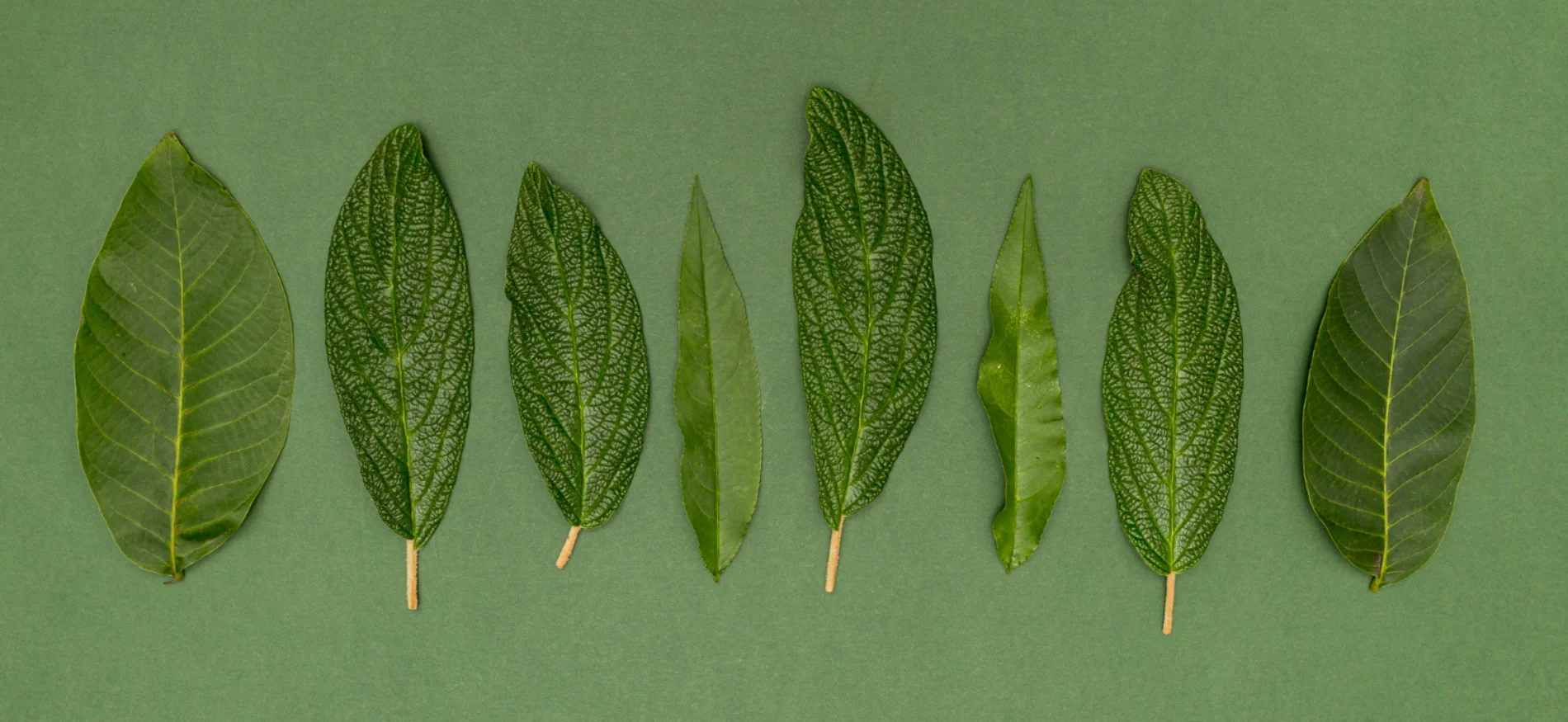
These palettes are deeply rooted in nature, evoking a sense of warmth, authenticity, and grounded stability. They typically combine muted or natural greens, such as sage, moss, or olive, with complementary earthy tones like browns, creams, beiges, and terracotta. The mood conveyed is natural, wholesome, rustic, stable, credible, abundant, fertile, and inviting, fostering a strong feeling of harmony with nature and a connection to natural ingredients or processes.
Earthy and organic greens are ideally suited for brands emphasizing sustainability, eco-friendliness, and natural ingredients. They are a perfect choice for wellness brands, artisan crafts, outdoor adventure companies, and for creating warm, inviting interior spaces. The consistent adoption of earthy green palettes by brands focused on sustainability, organic products, and natural ingredients signifies that this color choice transcends mere aesthetics; it is a direct visual representation of core brand values and a genuine commitment to environmental and ethical practices. When a brand explicitly states its dedication to sustainable materials and then visually reinforces this with green branding, it creates a powerful, authentic connection with the consumer. This is not just about looking “natural”; it is about signaling integrity, responsibility, and shared values. This deep alignment between visual identity and mission can significantly enhance consumer trust and loyalty, making the color choice a profound statement of purpose. Furthermore, while the term “organic” might sometimes imply a raw or unpolished aesthetic, these palettes demonstrate how blending muted greens with softer neutrals can achieve a sophisticated yet welcoming vibe. This reveals that “earthy” does not necessarily equate to “rough” or “unrefined.” By carefully combining muted greens with elegant, soft neutrals, designers can create a refined aesthetic that still feels natural and wholesome. This approach allows brands to appeal to a broader audience that values natural products but also appreciates elegance and subtlety, elevating the perception from purely “granola” to something more broadly appealing and premium.
Website Examples (4):
- Eleven Plants for Dum-Dums & Cool Ppl: This website, while a specific URL is not provided in the source material, is described as effectively using various shades of green and brown hues on a neutral cream background. This combination successfully conveys natural and organic themes, making it suitable for products related to plants and organic living.
- Organix: This brand, also without a direct live URL in the provided text, is noted for its use of vivid, raw shades of green in its backgrounds and product imagery. These greens are reminiscent of those found directly in nature, creating a strong impression of freshness and genuineness for its organic products.
- EarthHero (URL: https://earthhero.com/): This website prominently features green in its branding, including its logo, and focuses on promoting eco-friendly and sustainably-made products. Its visual identity is directly aligned with its core mission of environmental responsibility, reinforcing its commitment to a greener future.
- Amber Freda (URL: https://amberfreda.com/): The website for this New York City landscape artist, specializing in rooftop gardens, utilizes an olive green palette. This choice effectively conveys elegance, earthiness, and tranquility, perfectly suiting her brand and the natural beauty of her work.
Palette 2: Calm & Serene Greens
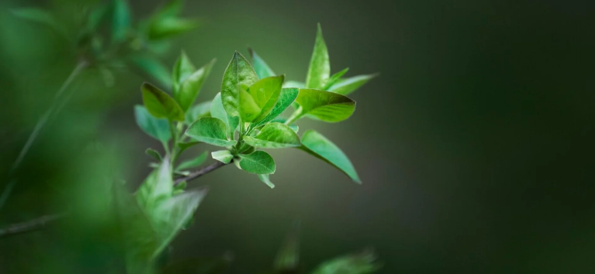
These palettes are characterized by softer, muted, or pastel shades of green, frequently paired with cool, light neutrals such as white, off-white, or light gray. The overarching goal is to create a peaceful, tranquil, and non-stimulating visual environment. The mood conveyed is inherently calm, serene, peaceful, trustworthy, and balanced, evoking feelings of quietude and mental clarity.
Calm and serene greens are highly recommended for healthcare and wellness spaces due to their proven anxiety-reducing properties. They are also ideal for financial services, where building trust and reducing client anxiety are paramount, as well as for meditation apps, minimalist interiors, and personal blogs where a relaxed and comfortable reading experience is desired. The effective use of calm green palettes by financial services and professional organizations demonstrates that these shades convey not just tranquility but also reliability, stability, and trust, establishing a “quiet authority.” In industries where trust is paramount, such as finance, a sense of calm can reduce user anxiety. Softer, serene greens, especially when paired with blues or neutrals, tap into green’s inherent association with stability and security. This subtle psychological effect is invaluable for building confidence, potentially leading to increased user engagement with sensitive information and improved conversion rates. Furthermore, websites leveraging calm green palettes often strategically reduce visual stress and cognitive load, directly improving content focus and user retention. This demonstrates a sophisticated application of color psychology directly to user experience. By creating a “non-stimulating environment”, these sites encourage longer reading sessions and better information processing. This is a deliberate design choice that shows aesthetics are not separate from usability but are deeply intertwined, where the color actively contributes to the site’s functional goals and user comfort.
Website Examples (4):
- Work Responsibly: This resource hub, though a live URL is not provided in the source material, is described as exemplifying digital wellness design. It employs a calm green and black text on a white background, creating a non-stimulating, reading-friendly environment conducive to focused engagement with its content.
- Mint (Intuit) (URL: https://mint.intuit.com/): This financial guidance platform strategically uses various shades of green and blue on a white background. This palette choice is deliberate, conveying professionalism, trust, and prosperity, which are critical attributes for a brand operating in the finance sector.
- Evernote: While a direct URL is not provided, Evernote is noted for promoting organization through a visual design featuring a subtle green palette with a white background and black writing. This minimalist approach creates a calming environment that helps users focus and encourages better organization.
- Mr. Claude (URL: https://mrclaude.com.au/): This website features a friendly and peaceful image above the fold, and its colors, including green tones, are harmoniously combined with ample white space. This design approach creates a consistent and serene online presence, fostering a sense of calm and reliability.
Palette 3: Vibrant & Energetic Greens
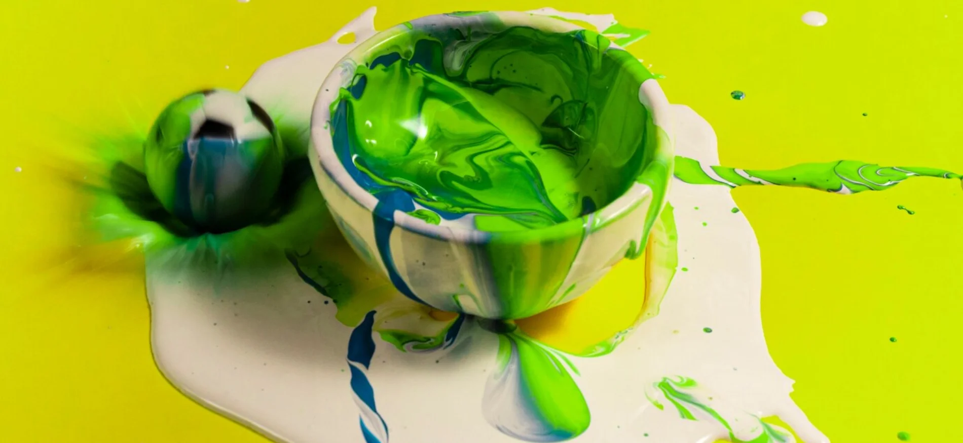
These palettes are characterized by bright, lively greens, often leaning towards lime, neon, or vivid emeralds. They are meticulously designed to immediately capture attention, convey dynamism, and inject a palpable sense of excitement and freshness into a design. The mood conveyed is energetic, lively, exciting, refreshing, invigorating, playful, innovative, adventurous, and youthful, aiming to stimulate and energize the viewer.
Vibrant and energetic greens are particularly effective for tech startups, mobile gaming applications, sports brands, creative agencies, and fashion lines that seek to make a bold statement. They can also be employed for environmental campaigns that desire a dynamic and modern twist, or for youth-oriented products looking to stand out. The successful application of vibrant greens in sectors like financial technology, mobile applications, and general tech or creative agencies demonstrates that green’s energy can transcend its typical natural associations to effectively convey innovation, modernity, and a playful edge. While blue is often the default for tech, the use of vibrant green allows these brands to differentiate themselves. Green’s associations with growth and freshness are reinterpreted dynamically, creating a memorable and engaging user experience that feels cutting-edge and unique. This is a strategic move to differentiate in a crowded market by leveraging green’s positive connotations in an unexpected, energetic way. However, the emphasis on pairing bold, vibrant green palettes with “minimalist typography, dynamic animations, and strategic whitespace” highlights the critical importance of careful design principles to prevent visual overload and maintain readability. Vibrant colors, while excellent for capturing attention, can quickly become overwhelming or cause eye strain if not managed meticulously. The solution lies in strategic contrast and visual hierarchy. By using bright green primarily for accents, calls-to-action, or specific elements against cleaner, neutral backgrounds, the energy is channeled effectively without sacrificing user comfort or content legibility. This demonstrates a sophisticated understanding of how to harness a powerful color without its potential drawbacks.
Website Examples (4):
- Connect Mania (URL: https://connectmania.com/): This mobile app game’s website utilizes soft-muted yet vibrant pastel greens. This palette choice evokes a strong sense of adventure, warmth, and fun, effectively personifying the joyful benefits users derive from playing the mobile game.
- Nerdwallet (URL: https://www.nerdwallet.com/): The website employs geometric shapes that embody different hues of its energizing green palette. This design approach gives the website a fresh and playful look, making the typically serious topic of financial management inviting and interesting to a broader audience.
- Tomlinson Bomberger (URL: https://tomlinsonbomberger.com/): For this landscaping and lawn care contractor, the website incorporates bright green as a key part of its palette. This color choice signifies rebirth and spring, aligning perfectly with their brand promise of “Creating beautiful landscapes and amazing experiences”.
- Squadeasy: While a direct live URL is not provided, this website is described as featuring a bright green homepage that quickly engages user attention. This vibrant green conveys energy and vitality, serving as a prime example of a well-designed, energizing green website.
Palette 4: Deep & Luxurious Greens
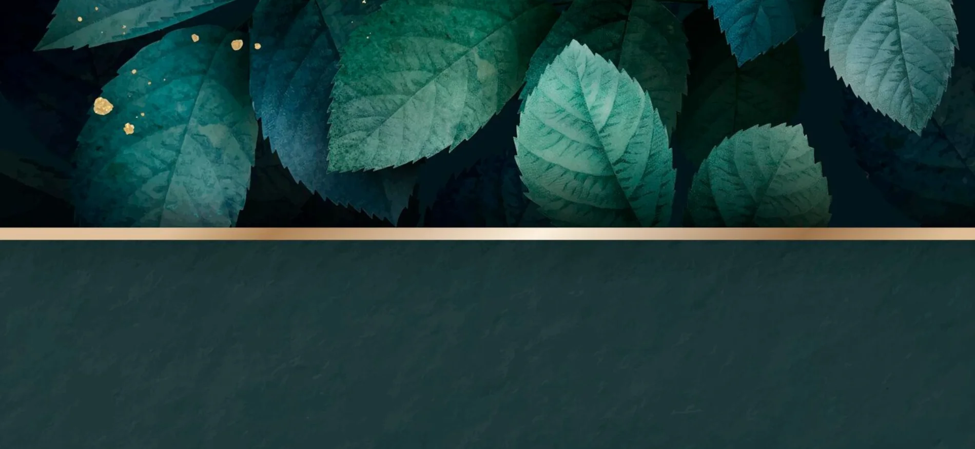
These palettes feature rich, saturated, and often dark greens such as emerald, forest, jade, or hunter green. They are frequently paired with metallic accents like gold or bronze, deep neutrals such as black or charcoal, or other jewel tones to amplify their opulent and sophisticated feel. The mood conveyed is one of sophistication, opulence, richness, professionalism, and classic elegance. These greens evoke a sense of heritage, high value, stability, and trust, often associated with prestige and academic tradition.
Deep and luxurious greens are ideally suited for high-end branding, luxury hospitality, corporate identities, legal firms, and academic institutions. They are also perfect for creating elegant, moody interior spaces. Furthermore, they are highly effective for brands that emphasize craftsmanship and a luxurious interpretation of nature-inspired design. The consistent application of these deep greens by luxury brands and professional services underscores their ability to communicate not just opulence, but also credibility and established authority. This color choice subtly signals a brand’s commitment to quality and enduring value, making it a powerful non-verbal communicator in competitive markets.
Website Examples (5):
- The Scott: This luxury hotel chain, while a direct live URL is not provided, is described as utilizing a rich tropical green for its website’s opening section. This deep green, sometimes with a smoky blue tint, is also used in typography and navigation elements, creating a fresh and elegant mood aligned with natural materials and lush greenery.
- Altermind: As a boutique business consultancy, Altermind chose deep green for its website, featuring a dark green background with architectural patterns and elegant white typography. This choice was made to convey professionalism, respectability, and opulence, aligning with the brand’s connection to academic tradition.
- Studio FAB: While a direct live URL is not provided, this luxury salon’s custom website design employs a dark theme with black, gold, and dark green. This combination imparts a distinctly high-end and sophisticated feel to the brand.
- Aletheia: This website, described as a “One Pager Award” winner, features a stunning dark green and gold color scheme for private tuition services. The combination of deep green with gold accents immediately communicates elegance and a premium service.
- Next Level Fairs by Geex Arts: This award-winning design presentation for a fine arts fair company, while a direct live URL is not provided, uses an elegant shade of dark green. Paired with a warm yellow for typography, it establishes a classical and sophisticated mood, suitable for a high-end arts event.
Palette 5: Modern & Minimalist Greens

These palettes are characterized by a clean, sleek, and contemporary aesthetic, often utilizing a single dominant shade of green complemented by ample white space. The emphasis is on clarity, simplicity, and a refined visual experience. The mood conveyed is modern, minimalist, fresh, clean, professional, and sophisticated. These palettes aim to reduce visual clutter and direct user focus efficiently.
Modern and minimalist greens are ideal for technology companies, corporate brands, design portfolios, and brands offering clean or eco-friendly products. They are also highly effective for creating uncluttered and serene digital environments that promote ease of navigation and a sophisticated user experience. The strategic use of white space in these designs is not merely an aesthetic choice but a functional one, allowing the green elements to breathe and stand out without overwhelming the user. This approach enhances readability and ensures that key information is easily digestible.
Website Examples (4):
- Forestry: While a direct live URL is not provided, this “Nature-Inspired Green Eco Webflow website template” is described as embracing elegance and sustainability. It features a palette of rich blacks, pristine whites, and vibrant greens, offering a modern, minimalist design focused on environmental messaging and innovation in responsible practices.
- Peak Dental (URL: https://www.peakdentaltexas.com/): This website is described as “very refreshing to the eyes” due to its pastel green and white theme. It combines sharp photos of smiling people and crisp videos, creating an energetic and refreshing navigation experience, while maintaining a clean and inviting aesthetic.
- Bakery Bar (URL: https://bakery.bar/): This website exemplifies minimalism by keeping its design simple and tidy. It leverages ample white space to enhance readability and allows its design elements to “breathe,” demonstrating how a clean layout can be highly effective without overwhelming users.
- Mr. Claude (URL: https://mrclaude.com.au/): The website for Mr. Claude features a friendly and peaceful image above the fold, and its colors, including green tones, are harmoniously combined with ample white space. This design approach creates a consistent and serene online presence, fostering a sense of calm and reliability.
Palette 6: Retro & Vintage Greens
These palettes draw inspiration from past eras, particularly the 1960s and 1970s, characterized by specific muted or bold green shades. They are often combined with warm oranges, yellows, and browns, along with retro typography and nostalgic imagery, to evoke a sense of the past. The mood conveyed is nostalgic, classic, authentic, and often playful or groovy, aiming to create an emotional connection through reminiscence.
Retro and vintage greens are ideal for heritage brands, themed experiences (e.g., retro diners, music venues), and fashion lines that embrace historical aesthetics. They are also suitable for designs seeking to convey a sense of authenticity, timelessness, or a unique, non-conformist vibe. The successful application of these palettes often relies on a consistent visual language that includes specific fonts, textures, and imagery that align with the chosen era. This attention to detail ensures the retro feel is genuine rather than merely superficial.
Website Examples (4):
- Nathan’s Hotdogs: While a direct live URL is not provided, this vintage website design is described as celebrating over 100 years of culinary tradition. It achieves a nostalgic journey through the use of nostalgic imagery, a warm yellow and green color palette, and retro typography.
- Spinlab: This vintage website design, though a direct live URL is not provided, is noted for captivating visitors with its warm tones, elegant typography, and harmonious visuals. It creates a timeless feel, making it perfect for music enthusiasts looking for a nostalgic yet modern aesthetic.
- Harvard Lanes: This website, without a direct live URL, is described as featuring retro coasters and a classic menu. It employs a warm color palette and nostalgic typography to evoke a sense of timelessness, with unique elements that enhance its modern design with a charming, vintage aesthetic.
- Retro 70s Vintage Website (designed by Ruslan Makhmatov on Dribbble): This website design concept, while a direct live URL is not provided, is noted for showcasing a retro 70s vintage aesthetic, demonstrating how to effectively integrate period-specific design elements into a modern web context.
Palette 7: Teal & Aqua Greens

These palettes are characterized by the interplay of teal, aqua, and other blue-green hues, often reminiscent of water, oceans, and tropical lagoons. They may be combined with crisp whites, light grays, or subtle metallic accents to enhance their refreshing quality. The mood conveyed is refreshing, clear, invigorating, serene, tranquil, and sophisticated. These colors promote a sense of calm and clarity, often associated with revitalization and energy.
Teal and aqua greens are ideally suited for travel and tourism brands, particularly those focused on coastal or water-related destinations. They are also highly effective for wellness and beauty brands, as they evoke feelings of purity and rejuvenation. Additionally, these colors can be used in tech and communication sectors to convey innovation and clarity, or for businesses related to water services. The combination of blue (tranquility, logic) and green (growth, empathy) in teal and aqua creates a natural balance between intellectual and emotional responses. This unique balance makes these palettes versatile for designs promoting emotional well-being and mental clarity, offering a rare and potent combination of calm and inspiration.
Website Examples (4):
- Wayfair: While a direct live URL is not provided, Wayfair is noted for utilizing a very consistent combination of purple and turquoise tones in both its website design and photography. This strategic use of color has contributed to significant revenue growth, demonstrating the power of a well-executed turquoise palette in e-commerce.
- Owltastic: This website, while a direct live URL is not provided, is listed among those displaying a great use of the color teal. This suggests a design that leverages teal’s disarming and welcoming quality to invite users into its content.
- Skype: As a prominent communication platform, Skype, though a direct live URL is not provided, is cited as a brand that effectively uses teal. This aligns with teal’s associations with clarity and communication, contributing to a user-friendly and approachable interface.
- Vimeo: This video hosting platform, while a direct live URL is not provided, is also listed as a notable example of effective teal usage in web design. This choice likely contributes to a sophisticated and clean visual experience, fitting for a creative media platform.
Palette 8: Monochromatic Green Harmony

Monochromatic green palettes are built upon a single base green hue, exploring its full range of tints (by adding white), shades (by adding black), and tones (by adding gray). This approach creates a cohesive, unified, and subtle yet profound sense of depth within a design. The mood conveyed is calm, soothing, unified, elegant, and sophisticated. These palettes offer visual unity, avoiding clashing colors and promoting a balanced and serene aesthetic.
Monochromatic green harmony is particularly effective for wellness brands, financial services (where trust is paramount), minimalist portfolios, and brands seeking to establish a strong, singular brand identity. It allows product images or key features to stand out without visual competition from other hues. This approach simplifies the design process by focusing on variations of one hue, enabling designers to quickly experiment with layouts, typography, and imagery while maintaining visual hierarchy through differing light and dark values. The use of green in a monochromatic scheme evokes growth, renewal


![_iPhone Screen Size & Resolution All iPhone Display Sizes Guide [2025] iPhone Screen Size & Resolution | All iPhone Display Sizes Guide [2025]](https://neefox.com/wp-content/uploads/elementor/thumbs/iPhone-Screen-Size-Resolution-All-iPhone-Display-Sizes-Guide-2025-rgmkelp2h92gpnmfqsmjdkahpn01tobstqqhbrcigg.png)

