

In the digital age, a church’s website often serves as its primary welcome mat, and the header is the most crucial part of that first impression. A modern church website header goes far beyond a simple logo and navigation; it’s a dynamic, inviting, and informative gateway that immediately communicates the church’s identity, values, and what visitors can expect. It’s about creating a digital embrace that feels as warm and welcoming as walking through the church doors.
This comprehensive guide will conceptualize the elements, principles, and best practices for designing a truly effective and modern church website header. We’ll explore how to balance spiritual messaging with practical information, leverage contemporary design trends, and ensure accessibility for all. By understanding the strategic importance of this digital storefront, churches can craft a header that not only looks beautiful but also effectively connects with their community, invites new members, and facilitates engagement.
The Strategic Importance of a Modern Church Website Header
The header of your church website is arguably the most critical piece of digital real estate. It’s the first thing visitors see, and it sets the tone for their entire experience. Its strategic importance lies in:
- First Impression: It immediately conveys your church’s professionalism, warmth, and relevance. A dated or cluttered header can deter visitors.
- Brand Identity: It visually communicates your church’s unique personality, values, and mission through its design, colors, and imagery.
- Navigation Hub: It provides instant access to the most vital information, guiding visitors to what they need quickly and intuitively (e.g., service times, ministries, contact).
- Call to Action: It can subtly or directly invite visitors to engage, whether it’s to “Plan Your Visit,” “Watch Online,” or “Learn More.”
- Trust & Credibility: A well-designed, functional header builds trust, signaling that your church is organized, forward-thinking, and cares about its online presence.
- Mobile Experience: On smaller screens, a well-designed header is crucial for maintaining usability and accessibility.
Core Principles of a Modern Church Website Header
Designing a header for a modern church requires balancing reverence and approachability with contemporary digital standards.
- Clarity & Simplicity: Avoid clutter. A clean, uncluttered design helps visitors quickly find what they need without feeling overwhelmed.
- Inclusivity & Approachability: The design should feel welcoming to everyone, regardless of their background or familiarity with church. Avoid overly exclusive or jargon-filled language.
- Brand Consistency: The header’s design elements (logo, colors, fonts) should align perfectly with the church’s overall branding, whether it’s traditional, contemporary, or community-focused.
- Responsiveness: It must adapt flawlessly to all screen sizes, from large desktop monitors to small mobile phones, ensuring a consistent user experience.
- Performance: The header should load quickly. Slow loading times can lead to high bounce rates.
- Emotional Connection: Through imagery and subtle design cues, the header can evoke feelings of peace, community, hope, or inspiration.
Key Elements of a Modern Church Website Header
A modern church website header typically includes several essential components, strategically placed for maximum impact and usability:
- Church Logo:
- Placement: Prominently displayed, usually in the top-left or center.
- Design: Clean, legible, and reflective of the church’s brand. It should be easily recognizable.
- Functionality: Always links back to the homepage.
- Primary Navigation (Menu):
- Clarity: Clear, concise labels for main sections (e.g., “About Us,” “Ministries,” “Sermons,” “Events,” “Give,” “Contact”).
- Hierarchy: Use dropdowns or mega-menus for sub-sections, but keep the top-level menu simple.
- Responsiveness: Transforms into a “hamburger” menu icon on mobile devices.
- Key Calls-to-Action (CTAs):
- Prominence: Often distinct buttons in the top-right corner.
- Examples: “Plan Your Visit,” “Watch Online,” “Give,” “New Here?” These should be the most important actions you want visitors to take.
- Color Contrast: Use a contrasting color to make CTAs stand out.
- Search Functionality (Optional but Recommended):
- A discreet search icon or bar, allowing visitors to quickly find specific content (e.g., a sermon topic, an event, a staff member).
- Social Media Links (Optional/Discreet):
- Small, recognizable icons linking to the church’s Facebook, Instagram, YouTube, etc. Often placed subtly in the top bar or footer, but sometimes in the header for quick access.
- High-Impact Visuals (Hero Section Integration):
- While technically part of the hero section below the header, the header’s design should integrate seamlessly with a compelling background image or video.
- Examples: A diverse congregation, a peaceful sanctuary, a community event, or abstract spiritual imagery.
- Overlay: Ensure text in the header is legible against the background, possibly using a subtle gradient or overlay.
- Service Times/Location (Optional/Discreet):
- For quick reference, some headers include a small, easily digestible line of text with primary service times or a city location.
Modern Design Trends for Church Website Headers
Leveraging contemporary design trends can make your church website feel current and inviting.
- Minimalism & Ample White Space: Clean lines, uncluttered layouts, and plenty of breathing room make the header feel sophisticated and easy to digest.
- Bold Typography: Using strong, modern fonts for the church name or key navigation elements can create visual impact.
- Subtle Animations & Micro-interactions: Gentle hover effects on menu items or a subtle fade-in for the logo can add polish without being distracting.
- Transparent Headers: A header that overlays a hero image or video, allowing the background content to show through. This creates a seamless, immersive feel.
- Sticky Headers: The header remains visible at the top of the screen as the user scrolls down, ensuring constant access to navigation and CTAs.
- Vibrant or Thoughtful Color Palettes: Moving beyond traditional muted tones to incorporate colors that evoke emotion, community, or hope, while maintaining readability.
- Photography-Driven Backgrounds: High-quality, authentic photos of people and community, rather than generic stock imagery.
- Accessibility Focus: Ensuring sufficient color contrast, keyboard navigability, and proper semantic HTML for screen readers.
Best Practices for Designing a Modern Church Website Header
- Prioritize Mobile: Design the mobile header first. If it works well on a small screen, it will scale effectively to larger ones.
- Keep it Concise: Only include essential information and navigation links. Too much clutter overwhelms visitors.
- Test Legibility: Ensure all text is easily readable against any background imagery or colors, especially on different devices and lighting conditions.
- Consistent Branding: Use your church’s official logo, brand colors, and approved fonts.
- User Testing: Gather feedback from actual church members and potential visitors to ensure the header is intuitive and effective.
- Optimize for Speed: Compress images and minimize code to ensure the header loads quickly.
- Clear Call to Action: Make your primary CTAs stand out visually and functionally.
- Accessibility Check: Use tools to ensure your header meets WCAG guidelines for color contrast, keyboard navigation, and screen reader compatibility.
Conceptual Examples of Modern Church Website Headers
Here are 30 conceptual examples illustrating different approaches and features you’d find on leading modern church websites, with external links for inspiration on the type of design element or trend:
Focus on Visual Impact & Welcome
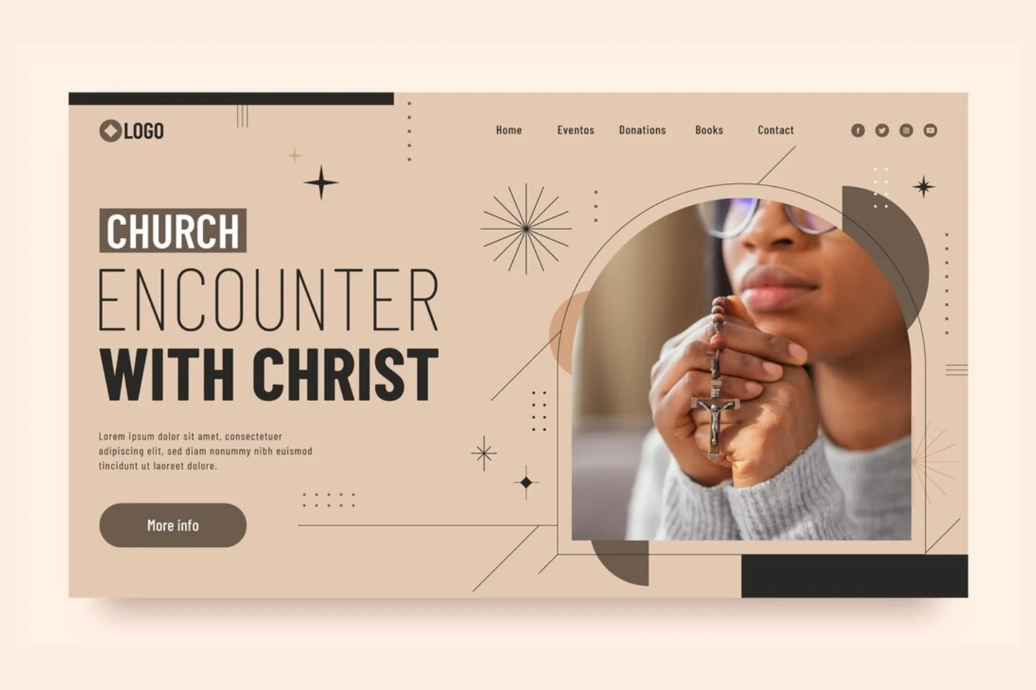
- The “Transparent Video Header”: A minimalist header (logo, menu, “Plan Your Visit” CTA) overlaid on a full-width, muted background video of diverse church members engaging in community activities.
- Inspiration: See examples of transparent headers with video backgrounds on Wix website templates.
- The “Live Service Stream Header”: During service times, the header subtly integrates a “LIVE NOW” banner with a direct link to the online stream, otherwise showing “Watch Past Sermons.”
- Inspiration: Live stream indicators on platforms like YouTube Live.
- The “Community Photo Carousel Header”: A clean header over a rotating carousel of high-resolution, authentic photos of church life – worship, fellowship, outreach – emphasizing connection.
- Inspiration: Image sliders on photography portfolio sites or event galleries. See Unsplash for high-quality stock photo inspiration.
- The “Seasonal Theme Header”: The header’s background image or subtle color scheme changes to reflect liturgical seasons (e.g., Advent, Lent, Easter) or major church events.
- Inspiration: Seasonal website themes used by e-commerce or holiday-focused sites.
- The “Hope & Light” Gradient Header: A header with a subtle, uplifting color gradient background (e.g., soft blues to warm yellows), paired with a clean white logo and navigation.
- Inspiration: Modern web design trends featuring gradients. See UI Gradients.
Emphasis on Navigation & Accessibility
- The “Sticky & Streamlined Header”: A compact header that remains visible as the user scrolls, featuring only the logo, a hamburger menu on mobile, and a “Give” button.
- Inspiration: Many modern blogs or news sites use sticky headers. See examples on UX design blogs about sticky elements.
- The “Mega-Menu Navigation”: A primary navigation system that, on hover, reveals a large dropdown panel with categorized links, images, and perhaps even short descriptions for ministries or events.
- Inspiration: E-commerce websites or large content portals. See Nordstrom’s mega-menu.
- The “Service Times & Location Bar”: A thin, contrasting bar above the main header displaying concise service times and a clickable location for quick reference.
- Inspiration: Contact bars on local business websites.
- The “Accessibility Toggle Header”: Includes a small, discreet icon (e.g., a person icon) that allows users to toggle accessibility features like high contrast mode, larger text, or screen reader optimization.
- Inspiration: Accessibility widgets from providers like UserWay.
- The “Search-First Header”: A prominent search bar or icon in the header, encouraging visitors to quickly find specific sermons, events, or information.
- Inspiration: Modern news websites or knowledge bases.
Building Community & Connection
- The “Connect with Us” Social Header: The header features subtle social media icons (Facebook, Instagram, YouTube) next to the main navigation, inviting immediate connection.
- Inspiration: Many brand websites include social links in their header or footer.
- The “New Here? Start Here” Button: A brightly colored, inviting CTA specifically for first-time visitors, leading to a welcome page.
- Inspiration: Onboarding flows on SaaS websites.
- The “Join a Small Group” CTA: A rotating CTA or dedicated button encouraging visitors to explore and join community groups.
- Inspiration: Community organization websites.
- The “Meet Our Leadership” Link: A prominent link in the navigation or a sub-menu that leads to bios and photos of church leadership, fostering personal connection.
- Inspiration: “Team” pages on corporate or non-profit websites.
- The “Upcoming Events Highlight”: A small, dynamic ticker or rotating banner in the header showcasing the next 1-2 major church events.
- Inspiration: Event calendars on community websites.
Modern Aesthetics & Branding
- The “Minimalist Logo & Typography Header”: A very clean header with just the church name in a modern, elegant font, and a simple, well-spaced menu.
- Inspiration: High-end brand websites or design portfolios.
- The “Subtle Pattern Overlay Header”: A header with a very faint, abstract geometric or organic pattern overlaid on a solid color or image, adding texture and depth.
- Inspiration: Modern web design trends featuring subtle patterns.
- The “Rounded Corners & Soft Shadows Header”: Elements within the header (buttons, search bar) feature soft rounded corners and subtle drop shadows, giving a modern, “neumorphic” feel.
- Inspiration: Neumorphism design examples on Dribbble.
- The “Vibrant Accent Color Header”: A largely neutral header with a single, bold accent color used strategically for CTAs or hover states, drawing attention to key elements.
- Inspiration: Brand style guides that use a primary and accent color.
- The “Clean Sans-Serif Typography Header”: Utilizes modern, highly readable sans-serif fonts throughout the header for a contemporary and approachable feel.
Practical & Functional Enhancements
- The “Language Selector Header”: For multicultural communities, a discreet dropdown menu allowing visitors to switch the website language.
- Inspiration: International corporate websites.
- The “Podcast/Sermon Player Link”: A direct link or small icon in the header that takes users to the latest sermon or the church’s podcast library.
- Inspiration: Podcast platforms like Spotify or Apple Podcasts.
- The “Give Online” Prominent Button: A clearly labeled and visually distinct button for online giving, often a primary CTA.
- Inspiration: Non-profit donation pages.
- The “Youth/Kids Ministry Quick Link”: A dedicated, easily identifiable link in the header or sub-menu for parents looking for children’s or youth programs.
- Inspiration: School websites or family-focused organizations.
- The “Location Finder Header”: For multi-campus churches, a simple “Locations” link or dropdown that helps users find the nearest campus.
- Inspiration: Multi-branch retail or service websites.
Innovative & Engaging Concepts
- The “Personalized Welcome Header”: If a user has visited before, the header might subtly change to “Welcome Back, [Name]” or highlight content relevant to their past interactions (requires user login/cookies).
- Inspiration: Personalized dashboards on streaming services or e-commerce sites.
- The “Countdown to Next Service Header”: A small, dynamic countdown timer in the header showing the time until the next worship service or major event.
- Inspiration: Event landing pages or product launch countdowns.
- The “Virtual Tour Link Header”: A prominent link in the header inviting visitors to take a 360° virtual tour of the church building or campus.
- Inspiration: Real estate virtual tours (e.g., Matterport).
- The “Impact Story Highlight”: A rotating text snippet in the header that briefly showcases a recent positive impact story or testimonial (e.g., “Helping 100+ Families This Month!”).
- Inspiration: Non-profit impact reports or charity websites.
- The “Statement of Faith/Values Snippet”: A very short, impactful phrase or scripture verse that rotates or is subtly displayed in the header, reflecting the church’s core beliefs.
- Inspiration: Mission statements on organizational websites.
Conclusion
A thoughtfully designed modern church website header is an indispensable tool for fostering connection, inviting engagement, and clearly communicating your church’s identity in the digital realm. By embracing principles of clarity, inclusivity, and responsiveness, and by strategically incorporating key elements and contemporary design trends, churches can create a welcoming and functional digital gateway. This first impression is crucial for reaching new individuals, serving existing members, and ensuring your message of faith and community resonates effectively in today’s interconnected world.
Frequently Asked Questions (FAQs)
Q1: What is the most important element to include in a modern church website header?
The most important elements are the church logo (linking to the homepage) and clear primary navigation (menu). These ensure visitors can immediately identify the church and find essential information. Prominent Calls-to-Action (CTAs) like “Plan Your Visit” or “Watch Online” are also critical.
Q2: Should a church website header be “flashy” or minimalist?
A modern church website header should generally lean towards minimalist and clean, prioritizing clarity and ease of use. While subtle animations or high-impact visuals can be effective, avoid anything overly “flashy” or distracting that might detract from the church’s message or make navigation difficult. The focus should be on approachability and functionality.
Q3: How do I make my church website header mobile-friendly?
To make your header mobile-friendly, adopt a mobile-first design approach. This typically means:
- Using a hamburger menu icon that expands into a full-screen or slide-out menu on smaller screens.
- Ensuring the logo is appropriately sized and legible.
- Limiting the number of visible elements to avoid clutter.
- Using large, tappable areas for navigation links and CTAs.
Q4: What are good Calls-to-Action (CTAs) for a church website header?
Effective CTAs for a church website header often include:
- “Plan Your Visit” (for new visitors)
- “Watch Online” (for live streams or archived sermons)
- “Give” or “Donate” (for online giving)
- “New Here?” or “Connect”
- “Join Us” These should be visually distinct and lead directly to the relevant page.
Q5: How can the header reflect the church’s unique identity?
The header can reflect your church’s unique identity through:
- Logo Design: A well-designed logo that embodies your church’s values.
- Color Palette: Using your specific brand colors consistently.
- Typography: Choosing fonts that convey your church’s personality (e.g., traditional, contemporary, warm, modern).
- Imagery: Integrating authentic photos of your actual congregation, building, or community events in the hero section that the header overlays.
- Language/Tone: Even the phrasing of menu items and CTAs can reflect your church’s approachability or formality.
Q6: Should service times be in the header?
It depends on your preference and the overall design. For quick reference, a discreet line of text with primary service times or a clickable location can be useful in the header. However, for a cleaner look, you might reserve detailed service information for a dedicated “Service Times” or “Plan Your Visit” page, which is easily accessible from the main navigation.
Q7: What are “sticky headers” and are they good for church websites?
A sticky header is a header that remains fixed at the top of the screen as the user scrolls down the page. They are generally considered good for church websites because they:
- Improve Navigation: Users always have access to the main menu and key CTAs.
- Enhance User Experience: Reduces the need to scroll back up to navigate.
- Maintain Branding: Keeps your logo and church name visible throughout the browsing experience. Ensure the sticky header is not too large, especially on mobile, to avoid taking up too much screen space.


![iPhone Screen Size & Resolution | All iPhone Display Sizes Guide [2025]](https://neefox.com/wp-content/uploads/elementor/thumbs/iPhone-Screen-Size-Resolution-All-iPhone-Display-Sizes-Guide-2025-rgmkelp2h92gpnmfqsmjdkahpn01tobstqqhbrcigg.png "_iPhone Screen Size & Resolution All iPhone Display Sizes Guide [2025]")

